Advanced column configuration for list views
Overview
Use Skedulo’s templating engine to enhance the data presented within a list view. This article provides a brief overview of some of the available templating features.
Please note, the column template supports HTML. Javascript is not currently supported.
Edit the column template
To edit a column template:
-
Navigate to Settings > Data management > Objects & fields.
-
Select a data object. For example, Jobs.
-
Click Edit default columns in the top right-hand corner of the screen to display the Edit default columns page.
-
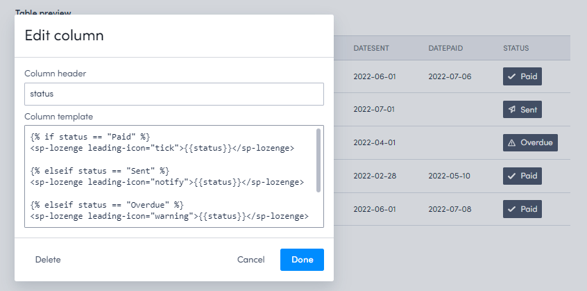
Click
 Edit column beside the name of the column you want to edit.
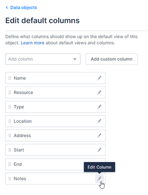
-
In the Edit column modal, use the examples listed below and update the Column template. For example, you can change the styling, format the numbers, or add a hyperlink.
-
Click Done to close the modal and view your changes in the Table preview window.
-
Click Save.
Cross object fields
Retrieve related data based on a lookup or relationship on the primary object. Prefix the field name with the cross object name. For example, if on the Work list view you wanted to display the related account’s Billing city, update the column template to the following:
{{ Account.BillingCity }}
Styling
- Bold:
<b>{{ FieldName }}</b> - Italics:
<i>{{ FieldName }}</i> - Underscore:
<u>{{ FieldName }}</u> - Color:
<span style="color: #HEX-CODE;">{{ FieldName }}</span>
Hyperlinks
Hyperlinks (anchors) are rendered with the brz-link component and they support standard anchor attributes (href, target, and rel).
There are two types of links: Primary and Secondary. Use the link-type property to change which one is used.
<brz-link href="url"> Primary link text </brz-link>
<brz-link href="url" link-type="secondary"> Secondary link text </brz-link>
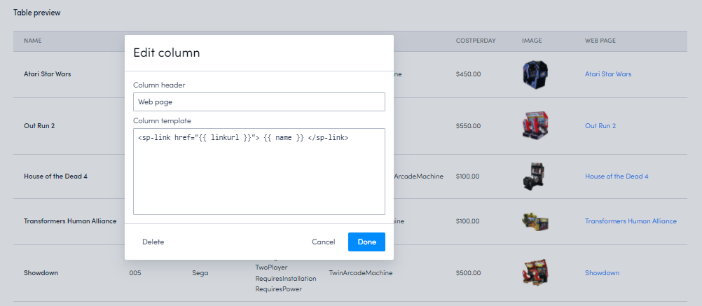
In this example, the linkurl value provides the URL and the name field provides the link text.
<brz-link href="{{ linkurl }}"> {{ name }} </brz-link>
Hyperlinks can be made relative so they can dynamically function across multiple team names. Note how https://team-name.my.skedulo.com is not required when defining the target URL. For example:
<brz-link href="/job/{{ UID }}">Job</brz-link>
Any field on the given object can be dynamically merged into the hyperlink template (including custom fields), enabling administrators to construct custom target URLs and dynamically generating the value presented within the cell on the list view.
In the below example, instead of a static value of Job being populated in the cell, the Name field on the Job object is being merged in:
<brz-link href="/job/{{ UID }}">{{ Name }}</brz-link>
Linking to another page within an object
If you want to link to another page associated with your object, you can use the buildPlatformUrl callback. For example, to add a link to an item’s edit page to each row, enter the following in a column template:
<brz-link href="{{_.host.buildPlatformUrl( 'invoice-edit?uid=' + _.record.primaryKeyValue )}}">Edit</brz-link>
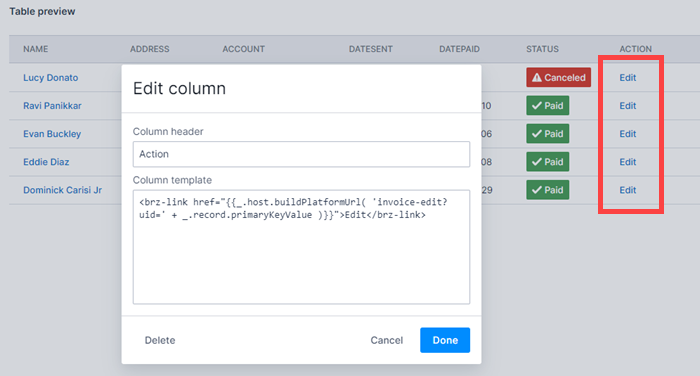
The buildPlatformUrl callback is used in place of /platform/page/ and enables you to link to a page using the slug alone. This means that even if the /platform/page/ path is changed, as long as the slug remains the same, the link to the page will still resolve.
Concatenation
Multiple fields can be merged within a column template by using the following syntax:
{{Field_One}} {{Field_Two}} {{Field_n}}
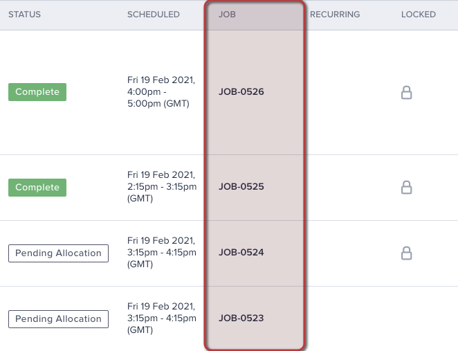
Additional styling can also be applied when concatenating fields. For example, the below example would produce “JOB-0526 - (Repair)” in a single column.
<b>{{ Name }}</b> - ({{ Type }})
If Statements
If statements test a condition and selectively display content. If a condition evaluates to true, the “true statement” is displayed; otherwise, the “false statement” will be displayed. It is also possible to specify alternate conditions with elseif.
For example, enter the following to check if the Type field is populated. If true, the cell will display the field value, if not, it will return Not set.
{% if Type %}

{{ Type }}

{% else %}

"Not set"

{% endif %}
elseif can be utilized to evaluate multiple conditions whilst applying alternate styling. For example:
{% if Type == "Repair" %} {# Check if the Type is equal to "Repair" #}

<b>{{ Type }}</b> {# If true, display the field value in bold #}

{% elseif Type == "Installation" %}{# Check if the Type is equal to "Installation" #}

<i>{{ Type }}</i> {# If true display the field value in italics #}

{& else &} {# otherwise #}

{{ Type }} {# display the field value with no additional styling #}

{% endif %} {# Closes the if statement #}
Expressions
You can use many types of literal expressions. For example:
- Strings:
"How are you?",'How are you?' - Numbers:
40,30.123 - Arrays:
[1, 2, "array"] - Dicts:
{ one: 1, two: 2 } - Boolean:
true,false
Math
Mathematical operations can be performed within list view cells. This should be done sparingly, because it will not enable users to filter or sort on the result as it is not stored within the database. The following operators are available:
- Addition:
+ - Subtraction:
- - Division:
/ - Division and integer truncation:
// - Division remainder:
% - Multiplication:
* - Power:
**
For example, if you wish to display the cost of a job based on the scheduled duration, a custom field can store the Rate value on the Job object.
{{ Duration * Rate }}
Comparisons
- Equals:
== - Equals (strict):
=== - Not equal to:
!= - Not equal to (strict):
!== - Greater than: >
- Greater than or equal to:
>= - Less than:
< - Less than or equal to:
<=
For example:
{% if Duration > 60 %}

Extended appointment

{% else %}

Standard appointment

{% endif %}
Logic
- and:
and - or:
or - not:
not - Use parentheses to group expressions.
Number formatting
Use the number function to format numbers so they are presented in a more user-friendly way. For example, control how many decimal places will be displayed. Any trailing decimals will be rounded.
For example, to round all numbers entered in a column to two decimal places, enter the following:
{{ Total | number(decimals=2) }}
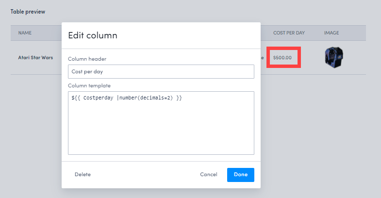
Currency
To add a currency symbol to a number column, enter the symbol before the brackets when editing the column template. For example, to display the figure in the Cost per day column as dollars, enter the following:
${{ Costperday |number(decimals=2) }}
This will render as:
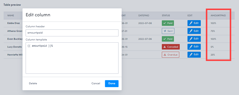
Percentage
To display a number as a percentage, add the % after the logic. For example, to display the value in the Amount Paid field with a percentage symbol, enter the following:
{{ amountpaid}}%
This will render as:
Date formatting
Date and Date/Time are stored in UTC format; if output directly within the column template, users wouldn’t see an overly human readable value, for example 2021-02-19T16:00:00.000Z. To display this value in a format that is easily recognizable, the following options are available:
| Modifier | Output | |
|---|---|---|
| Day | D |
1 … 5, 6 |
do |
1st, 5th, 6th | |
dd |
Su, Mo … Fri, Sa | |
ddd |
Sun | |
dddd |
Sunday, Monday … Friday, Saturday | |
| Month | M |
1, 2 … 11, 12 |
Mo |
1st, 2nd … 11th, 12th | |
MM |
01, 02 … 11, 12 | |
MMM |
Jan, Feb … Nov, Dec | |
MMMM |
January, February … November, December | |
| Year | YY |
20, 21 … 24, 25 |
YYYY |
2020, 2021 … 2024, 2025 | |
| Quarter | Q |
1, 2, 3, 4 |
Qo |
1st, 2nd, 3rd, 4th | |
| AM/PM | A |
AM, PM |
a |
am, pm | |
| Hour | H |
0, 1 … 22, 23 |
HH |
00, 01 … 22, 23 | |
h |
1, 2 … 11, 12 | |
hh |
00, 01 … 11, 12 | |
k |
1, 2 … 23, 24 | |
kk |
01, 02 … 23, 24 | |
| Minute | m |
0, 1 … 58, 59 |
mm |
00, 01 … 58, 59 | |
| Timezone | z |
BST, CET, GMT |
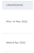
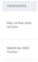
For example:
{{ CreatedDate | date("ddd D MMM YYYY") }}
{{ CreatedDate | date("ddd D MMM YYYY h:mma") }}
{{ CreatedDate | date("ddd D MMM YYYY h:mma (z)") }}

Time formatting
The ’time’ value of a date/time field can be isolated to display only the ’time’ within the cell on a list view. For example:
{{ CreatedDate | date("h:mma (z)") }}

Timezone manipulation
By default, all date/time values are adjusted from UTC to the timezone set on the device accessing Skedulo. Sometimes, it may be a requirement to adjust the date/time to an alternate timezone. For example, when displaying a list of jobs, the user would most often like to see when the Job is taking place for the customer instead of the time it would be for the user. (Assuming the users’ timezone differs from the timezone of the Job.)
Administrators can configure any date/time field to be presented in any valid timezone.
For example:
{{ Start | date("tz", Region.Timezone) }}
{% if Start %}

{% set tzStart = Start | date("tz", Region.Timezone) %}
{% set tzEnd = End | date("tz", Region.Timezone) %}

{{ tzStart| date("ddd D MMM YYYY") }}, </br>
{{ tzStart|date("h:mma") }} - {{ tzEnd|date("h:mma (z)") }}

{% else %}
<span style="color: #7d879c;">Not Set</span>

{% endif %}
Multi-select picklist fields
If you have a field that allows the selection of multiple options, you can choose to truncate or wrap the text in order to prevent the columns from becoming too wide.
Wrapping text
To have each value on a new line, enter the following into the Column template field, where category is the field name:
<ul> {% for item in category %}
<li>{{item}}</li>
{% endfor %} </ul>
To have each value as a lozenge on a new line, enter the following into the Column template field, where category is the field name:
{% for item in category %}<brz-lozenge style="margin: var(--sp-spacing-1)" theme="subtle" color="neutral">{{item}}</brz-lozenge>{% endfor %}
To have values numbered and on new lines, enter the following into the Column template field, where category is the field name:
<ul>
{% for item in category %}
<li>{{loop.index}} {{item}}</li>
{% endfor %}
</ul>
Truncating text
To limit the characters displayed in a multi-picklist field (for example, to 50), enter the following in the Column template field, where category is the field name:
{% if category %}{{ category | string | truncate(50, "...")}}{% endif %}
Lozenges
The Breeze UI lozenge component, brz-lozenge, can be used to highlight the state or status of something. For example:
<brz-lozenge>{{status}}</brz-lozenge>
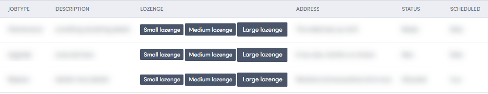
Lozenge sizes
Lozenges support different sizes using the size property. You can choose between small, medium, and large. It will default to medium if no size is specified. For example:
<brz-lozenge size="small">Small lozenge</brz-lozenge>

<brz-lozenge size="medium">Medium lozenge</brz-lozenge>

<brz-lozenge size="large">Large lozenge</brz-lozenge>
Supporting icons
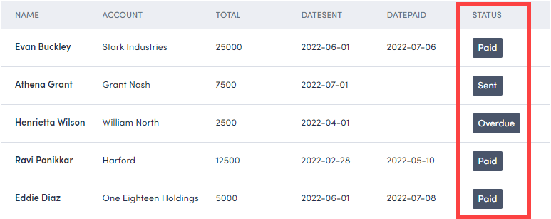
Lozenges can be rendered with an icon using the loading-icon property. For example, if you have a Status field and want to have a different icon displayed for each different value, you could enter the following in the Edit column modal:
{% if status == "Paid" %}
<brz-lozenge leading-icon="tick">{{status}}</brz-lozenge>

{% elseif status == "Sent" %}
<brz-lozenge leading-icon="notify">{{status}}</brz-lozenge>

{% elseif status == "Overdue" %}
<brz-lozenge leading-icon="warning">{{status}}</brz-lozenge>

{% else %} {{ status }}

{% endif %}
A full list of all available icons is available from the Design system documentation.
Current user
Control which data is displayed depending on the currently logged-in user. Available fields could vary depending on how the Users, Resources, and PrimaryRegion objects are configured on each tenant but as default, they would most likely be:
| Object | Fields |
|---|---|
| Users | City, Country, CreatedById, CreatedDate, Email, FirstName, FullPhotoUrl, IsActive, LastModifiedById, LastModifiedDate, LastName, MobilePhone, Name, PostalCode, SmallPhotoUrl, State, Street, UID, UserTypes, Roles, messaging_beta_access |
| Resources | Alias, AutoSchedule, Category, CountryCode, CreatedById, CreatedDate, Date, Email, EmploymentType, GeoLatitude, GeoLongitude, HomeAddress, IsActive, LastModifiedById, LastModifiedDate, MobilePhone, Name, Notes, NotificationType, Number, PrimaryPhone, PrimaryRegionId, Rating, ResourceActivityId, ResourceLookupId, ResourceType, Text, UID, UserId, WeeklyHours, WorkingHourType, ResourceAvatar, User |
| PrimaryRegion | Timezone, Description, Radius, LastModifiedDate, Radius, LastModifiedBy, Description, CreatedBy, GeoLatitude, almost_clear, covid_case_count, GeoLongitude, Name, CreatedById, CreatedDate, CountryCode, LastModifiedById, UID |
Use cases
The fields can be accessed by using $CurrentUser as the Nunjucks syntax in column templates, for example:
-
Region
{{ $CurrentUser.Resources[0].PrimaryRegion.Name }}On an if condition:
{{ % if $CurrentUser.Resources[0].PrimaryRegion.Name == Job.Region.Name % }} X {{ % else % }} Y {{ % endif % }} -
Category
{{ $CurrentUser.Category }} -
Type
{{ $CurrentUser.UserTypes }}
Feedback
Was this page helpful?