Multi-selector
Description
The multiSelector component is used to render a multi-select picklist in a flat page. This component allows users to select multiple options from a list of pre-defined options.
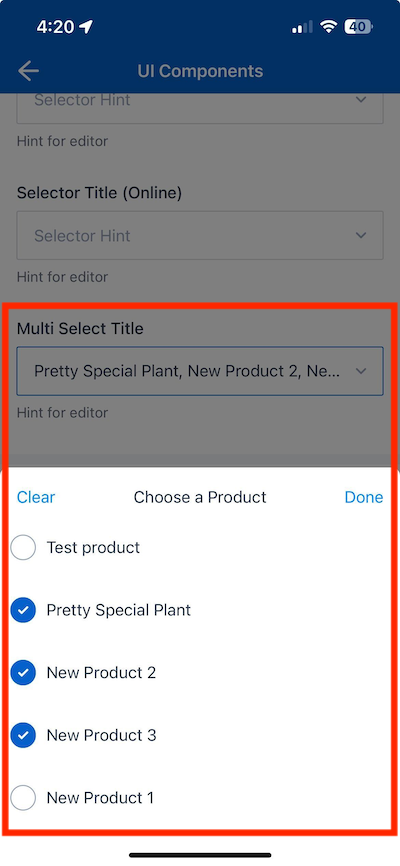
The following example demonstrates how the multi-selector component in the UI Components Showcase example form appears when uploaded to Skedulo Plus.
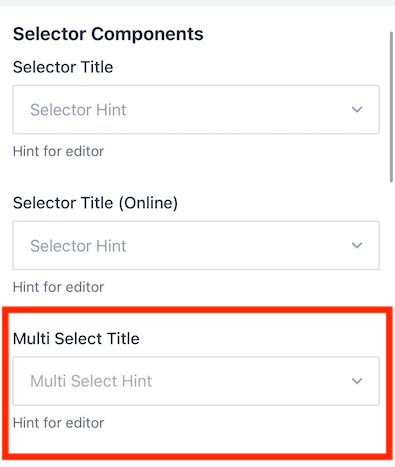
The multi-selector component displays data in a similar list format to the single selector component, but allows users to select multiple options.
Note
You can download our example forms, including the UI Components Showcase from the Skedulo Plus Examples repository.Properties
When utilizing the multiSelector component, two common scenarios typically arise:
-
Multi-picklist field: Following selection, the chosen values are collected into an array and linked to a single field within an object.
-
N-N object relationship: Upon selection, multiple records of that object are generated.
In addition to the shared properties, we provide distinct properties tailored to the logic of each scenario. Refer to the details below for more information.
| Property | Description |
|---|---|
showIfExpression |
When the showIfExpression property is defined, it adjusts the component visibility based on the boolean value returned by the expression. |
title |
The title of the field. |
caption |
The caption of the field. This could be a brief description or explanatory text displayed at the bottom of the component. |
validator |
Validation logic for the field. |
readonly |
Indicates whether or not an editor control is read-only. |
mandatory |
True or False expression. An asterisk ( * ) is shown on the title of the editor if it is mandatory for the user to fill. Note that this property only controls whether the asterisk will show on the UI and won’t affect the validation. Use the validator property to add validation. |
sourceExpression |
Predefined set of data that users can choose from. If not defined, onlineSource must be specified. |
onlineSource |
The online source that is used to retrieve the data. This data is read-only in online mode. |
displayExpression* |
Indicates which property’s value is shown. For example, if the displayExpression is "pageData.Product.Name", the value of field Name of the "page.Data.Product" is displayed in the UI of the editor after the user has selected the item. |
caption |
A localized expression string defining additional data of the selected item in the editor. |
placeholder |
The placeholder text that is a hint or description shown inside the text field before the user enters a value. |
selectPage |
Specifies the page displaying the list of selectable items. |
selectPage.itemTitle |
A localized expression defining how to render the title of each selected item. |
selectPage.itemCaption |
A localized expression defining how to render the caption of each selected item. |
selectPage.emptyText |
A localized expression defining the text displayed when there are no items to select. |
selectPage.title |
A localized expression string defining how to render the title of the select page (navigation title). |
searchBar |
Enables the search bar on the selected page. If not defined, the search bar won’t be shown. |
searchBar.placeholder |
A localized expression defining the placeholder text displayed in the search bar. |
searchBar.filterOnProperties* |
An array defining the properties used to filter items in the list. |
filterExpression |
The data expression returns a boolean value. Refer to this section. |
Example
The following example demonstrates how the multiSelector component in the example above is configured in the ui_def.json file of the UI Components Showcase example form.
ui_def.json
{
            "type": "multiSelectEditor",
            "title": "form.ShowCasePage.MultiSelectProduct",
            "structureExpression": "pageData.ShowCaseMultiProducts",
            "sourceExpression": "sharedData.Products",
            "displayExpression": "item.ShowCaseProduct.Name",
            "displayDataInSearchPageExpression": "item.ShowCaseProduct",
            "placeholder": "form.ShowCasePage.MultiSelectProductHint",
            "readonly": "pageData.Disabled",
            "constructResultObject": {
                "data": {
                    "ShowCaseProduct": "${item}",
                    "ShowCaseObjectId": "${pageData.UID}",
                    "ShowCaseProductId": "${item.UID}"
                },
                "objectName": "ShowCaseMultiProduct",
                "compareProperty": "ShowCaseProductId"
            },
            "selectPage": {
            "itemTitle": "form.ShowCasePage.SelectProductItemTitle",
            "emptyText": "form.ShowCasePage.SelectProductEmpty",
            "title": "form.ShowCasePage.SelectProductTitle",
            "searchBar": {
                "filterOnProperties": [
                "Name"
                ]
            }
            },
            "validator": [],
            "caption": "form.ShowCasePage.EditorHint"
        }
    ]
},
en.json
The corresponding localized strings in the /static_resources/locales/en.json file are:
{
    "MultiSelectProduct": "Multi Select Title",
    "MultiSelectProductHint": "Multi Select Hint",
    "SelectProductItemTitle": "${item.Name}",
    "SelectProductEmpty": "No Products",
    "SelectProductTitle": "Choose a Product",
    "EditorHint": "Hint for editor",
}
Feedback
Was this page helpful?