Text editor
Description
The textEditor component is used to render a text editor field that allows users to enter text or number data in a Skedulo Plus extension flat page.
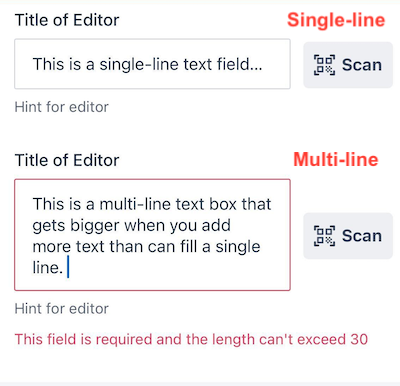
Text editor components can be both single-line and multi-line text fields. The following example demonstrates how the text editor component appears in the UI Components Showcase example form.

Note
You can download our example forms, including the UI Components Showcase from the Skedulo Plus Examples repository.Properties
| Property | Description |
|---|---|
showIfExpression |
When the showIfExpression property is defined, it adjusts the component visibility based on the boolean value returned by the expression. |
title |
The title of the field. |
caption |
The caption of the field. This could be a brief description or explanatory text displayed at the bottom of the component. |
validator |
Validation logic for the field. |
readonly |
Indicates whether or not an editor control is read-only. |
mandatory |
True or False expression. An asterisk ( * ) is shown on the title of the editor if it is mandatory for the user to fill. Note that this property only controls whether the asterisk will show on the UI and won’t affect the validation. Use the validator property to add validation. |
multiline |
A boolean value that determines whether the text editor is a single-line or multi-line text field. * If true, the text editor expands when typing longer texts. * If false, the text editor is a single-line text field.The default value is false. |
keyboardType |
* undefined - The default keyboard.* number-pad - Shows the keyboard number pad.If the keyboardType is number-pad, the data value type will always be a number rather than a string, for example, 5 instead of "5".* phone-pad - Shows the keyboard for phone number input. * email-address - Shows the keyboard for email input. |
valueExpression |
The data binding expression that defines the data context. |
placeholder |
The placeholder text that is a hint or description shown inside the text field before the user enters a value. |
features.useBarcodeAndQRScanner |
A boolean value that determines whether the barcode and QR scanner is enabled for the text editor field. The default value is false. |
Example
The following example demonstrates how the textEditor component in the example above is configured in the ui_def.json file of the UI Components Showcase example.
The validation logic for the field is also defined in the validator property, which states that the number entered must be greater than 0 and less than 30.
ui_def.json
{
    "type": "textEditor",
    "valueExpression": "pageData.SingleLineText",
    "title": "form.ShowCasePage.SingleLineText",
    "placeholder": "form.ShowCasePage.SingleLineTextHint",
    "validator": [],
    "features": {
    "useBarcodeAndQRScanner": true
    },
    "caption": "form.ShowCasePage.EditorHint",
    "readonly": "pageData.Disabled"
},
{
    "type": "textEditor",
    "valueExpression": "pageData.MultilineText",
    "title": "form.ShowCasePage.MultilineText",
    "placeholder": "form.ShowCasePage.MultilineTextHint",
    "multiline": true,
    "readonly": "pageData.Disabled",
    "validator": [
    {
        "type": "expression",
        "errorMessage": "form.ShowCasePage.MultiLineTextValidationHint",
        "expression": "pageData.MultilineText && pageData.MultilineText.length > 0 && pageData.MultilineText.length <= 30"
    }
    ],
    "features": {
        "useBarcodeAndQRScanner": true
    },
    "caption": "form.ShowCasePage.EditorHint"
}
en.json
The corresponding localized strings in the /static_resources/locales/en.json file are:
{
  "forms": {
    "ShowCasePage": {
      "SingleLineText": "Title of Editor",
      "SingleLineTextHint": "Placeholder of text editor",
      "MultilineText": "Title of Editor",
      "MultilineTextHint": "Placeholder of text editor",
      "MultiLineTextValidationHint": "This field is required and the length can't exceed 30",
      "EditorHint": "Hint for editor",
      ...
    }
  }
}
Feedback
Was this page helpful?