Toggle
The toggle component is used to render a toggle switch, checkbox, or radio button on a flat page.
Description
The toggleEditor component is used to create different interactive controls, including a toggle switch, checkbox, and radio button, on a flat page. These allow users to choose one or more options, depending on the use case.
The three variations are used for slightly different purposes:
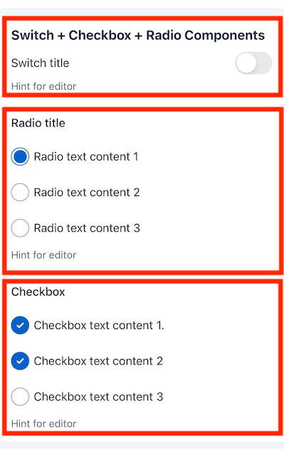
- Switch: A switch is used to toggle between two states, such as on and off.
- Checkbox: A checkbox is used to select one or more options from a list of items.
- Radio: A radio button is used to select a single option from a list of items.
These are illustrated below, where you can see how the toggleEditor component appears within a section that has a title in the UI Components Showcase example form on a flat page.
Note
You can download our example forms, including the UI Components Showcase from the Skedulo Plus Examples repository.Properties
| Property | Description |
|---|---|
showIfExpression |
When the showIfExpression property is defined, it adjusts the component visibility based on the boolean value returned by the expression. |
title |
The title of the field. |
caption |
The caption of the field. This could be a brief description or explanatory text displayed at the bottom of the component. |
validator |
Validation logic for the field. |
readonly |
Indicates whether or not an editor control is read-only. |
mandatory |
True or False expression. An asterisk ( * ) is shown on the title of the editor if it is mandatory for the user to fill. Note that this property only controls whether the asterisk will show on the UI and won’t affect the validation. Use the validator property to add validation. |
items |
A list of toggle items metadata. |
mode |
The mode of the toggle component. The mode can be switch, checkbox, or radio. |
Toggle item metadata
| Property | Description |
|---|---|
valueExpression |
The data expression used to assess the value of the toggle item. |
onValue |
The value of the toggle item when it is on. This is not required for switch mode. |
offValue |
The value of the toggle item when it is off. This is not required for switch mode. |
text |
The localized text to display next to the toggle item. |
Example
The following example demonstrates how the toggleEditor components in the example above are configured in the ui_def.json file of the UI Components Showcase example form and the corresponding en.json localization file.
Switch mode
ui_def.json
{
    "type": "toggleEditor",
    "mode": "switch",
    "items": [
    {
        "valueExpression": "pageData.Switch1",
        "text": "form.ShowCasePage.Switch"
    }
    ],
    "caption": "form.ShowCasePage.EditorHint",
    "readonly": "pageData.Disabled"
},
en.json
{
    "Switch": "Switch title",
    "EditorHint": "Hint for editor",
}
Checkbox mode
ui_def.json
{
    "type": "toggleEditor",
    "mode": "checkbox",
    "title": "form.ShowCasePage.Checkbox",
    "readonly": "pageData.Disabled",
    "items": [
    {
        "valueExpression": "pageData.Checkbox11",
        "text": "form.ShowCasePage.Checkbox1_1"
    },
    {
        "valueExpression": "pageData.Checkbox12",
        "text": "form.ShowCasePage.Checkbox1_2"
    },
    {
        "valueExpression": "pageData.Checkbox13",
        "text": "form.ShowCasePage.Checkbox1_3"
    }
    ],
    "validator": [
    {
        "type": "expression",
        "errorMessage": "form.ShowCasePage.CheckboxValidationHint",
        "expression": "pageData.Checkbox13 == true || pageData.Checkbox12  == true || pageData.Checkbox11  == true"
    }
    ],
    "caption": "form.ShowCasePage.EditorHint"
}
en.json
{
    "Checkbox": "Checkbox",
    "Checkbox1_1": "Checkbox text content 1.",
    "Checkbox1_2": "Checkbox text content 2",
    "Checkbox1_3": "Checkbox text content 3",
    "CheckboxValidationHint": "Checkbox validation message",
    "EditorHint": "Hint for editor",
}
Radio mode
ui_def.json
{
    "type": "toggleEditor",
    "mode": "radio",
    "title": "form.ShowCasePage.Radio",
    "readonly": "pageData.Disabled",
    "items": [
    {
        "valueExpression": "pageData.Radio1",
        "onValue": 1,
        "text": "form.ShowCasePage.Radio1_1"
    },
    {
        "valueExpression": "pageData.Radio1",
        "onValue": 2,
        "text": "form.ShowCasePage.Radio1_2"
    },
    {
        "valueExpression": "pageData.Radio1",
        "onValue": 3,
        "text": "form.ShowCasePage.Radio1_3"
    }
    ],
    "caption": "form.ShowCasePage.EditorHint"
},
en.json
{
    "Radio": "Radio title",
    "Radio1_1": "Radio text content 1",
    "Radio1_2": "Radio text content 2",
    "Radio1_3": "Radio text content 3",
    "EditorHint": "Hint for editor",
}
Feedback
Was this page helpful?