Components available in the Skedulo Plus Form Builder
Overview
The Skedulo Plus Form Builder provides a range of components that you can use to create custom mobile forms for the Skedulo Plus mobile application. These components allow you to capture data from your mobile users and create custom workflows.
Components in the Skedulo Plus Form Builder
The following components are available in the Skedulo Plus Form Builder.
Text input
The text input component is used to capture single-line text input from the user. The text input field supports up to 255 characters.
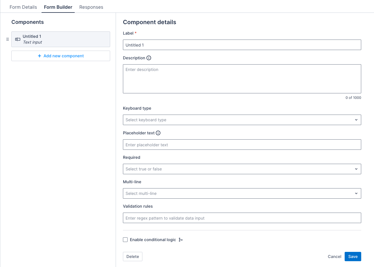
Properties
| Property | Description | Required |
|---|---|---|
| Label | The title of the text input component. | Yes |
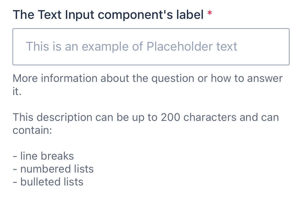
| Description | A text string that displays below the component to provide users with additional information about how to complete the item using this component. The character limit is 2000 and it can contain line breaks and numbered or bulleted lists. | No |
| Keyboard type | The keyboard type for the text input. Select the type from the drop down menu:
|
No |
| Placeholder text | The placeholder text for the text input. | No |
| Required | If selected, the text input must be completed to save the form. | No |
| Validation rules | A regex pattern to validate the data input. | No |
| Enable barcode scanner | If selected, this enables the option to scan a barcode in the text input. | No |
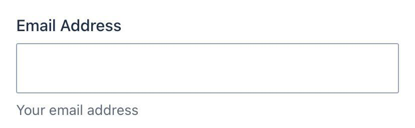
Examples
The images that follow show how the component appears in a form in the Skedulo Plus app when it has different configuration options selected:
| What the component looks like in the app | Description |
|---|---|
 |
A single-line text input component that has a placeholder text, and is required to fill out. |
 |
A single-line text input component that has a description, and is not required to fill out. |
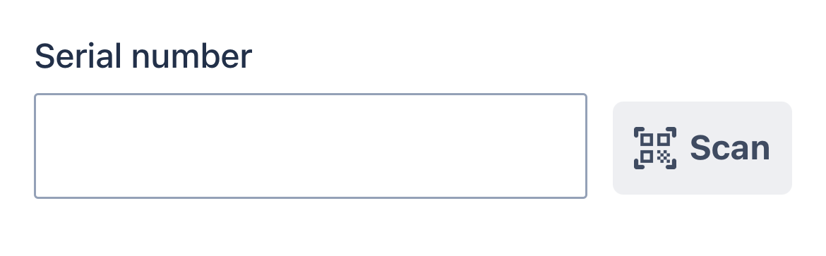 |
A text input with a barcode scanner. |
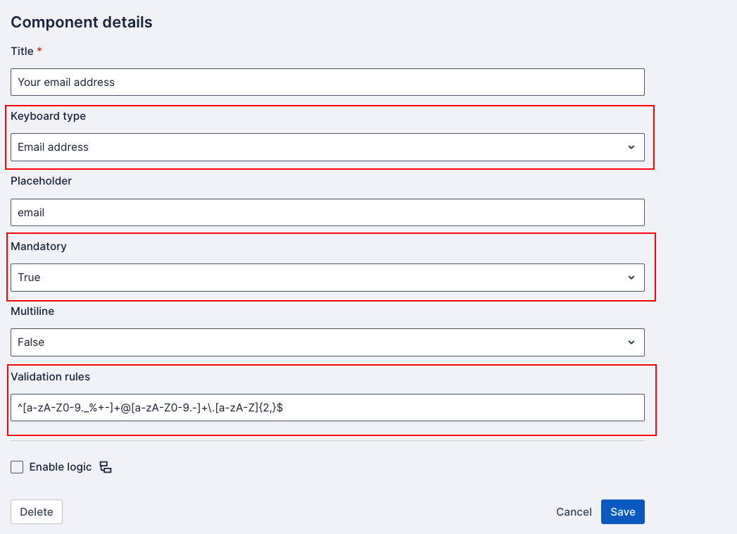
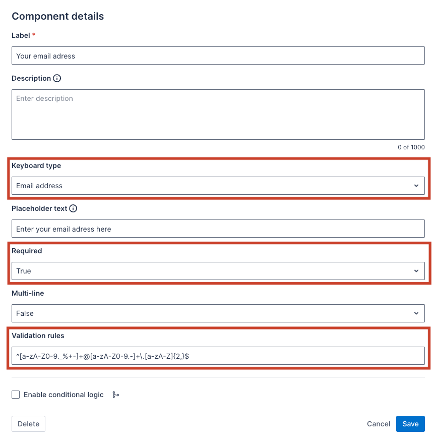
Example validation rule
Validation rules support regular expression (regex) patterns to validate the data input of your text input component. An invalid input will display an error message to the user, and the form will not be saved until the input is corrected.
For example, to validate an email address, use the following regex pattern:
^[a-zA-Z0-9._%+-]+@[a-zA-Z0-9.-]+\.[a-zA-Z]{2,}$
In the Form Builder:
Text area
The text area component is used to capture single or multiple lines of text input from the user. The text area field supports up to 131,072 characters.
Note
For data-mapped forms, if the mapped field has a maximum length, the character limit in the form will follow it.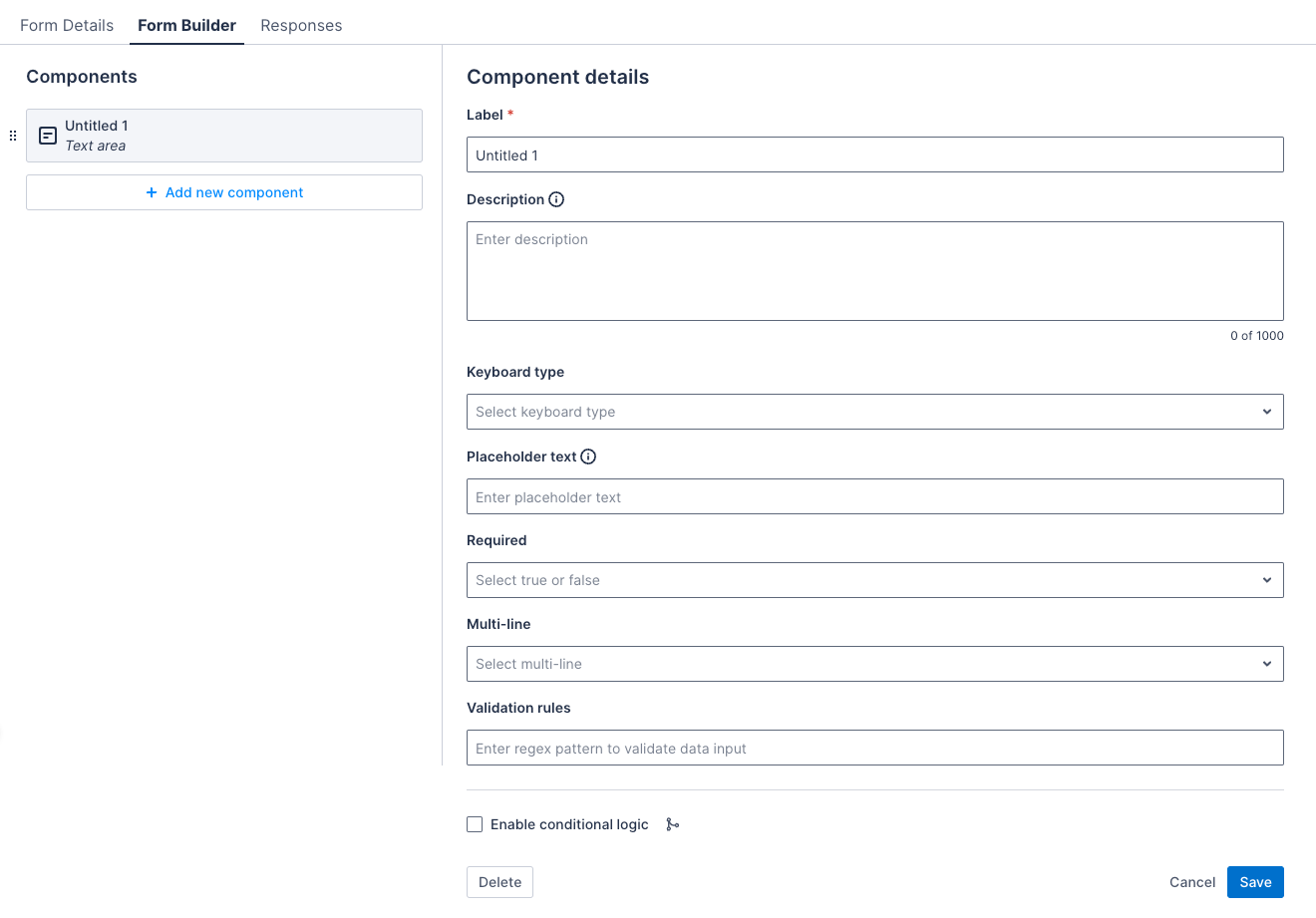
Properties
| Property | Description | Required |
|---|---|---|
| Label | The title of the text input component. | Yes |
| Description | A text string that displays below the component to provide users with additional information about how to complete the item using this component. The character limit is 2000 and it can contain line breaks and numbered or bulleted lists. | No |
| Keyboard type | The keyboard type for the text input. Select the type from the drop down menu:
|
No |
| Placeholder text | The placeholder text for the text input. | No |
| Required | If selected, the text input must be completed to save the form. | No |
| Multi-line | If selected, the text input will allow multiple lines of text. | No |
| Validation rules | A regex pattern to validate the data input. | No |
| Enable barcode scanner | If selected, this enables the option to scan a barcode in the text input. | No |
Examples
The images that follow show how the component appears in a form in the Skedulo Plus app when it has different configuration options selected:
| What the component looks like in the app | Description |
|---|---|
 |
A single-line text input component that has a description, and is not required to be filled out. |
 |
A multi-line text input component that has a placeholder text and a multi-line description with line breaks, and is required to be filled out. |
|
A text input with a barcode scanner. |
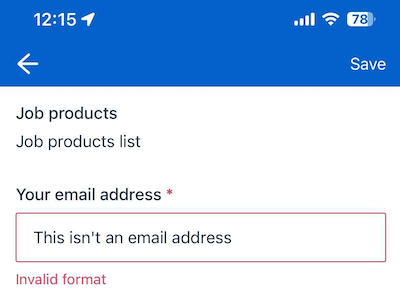
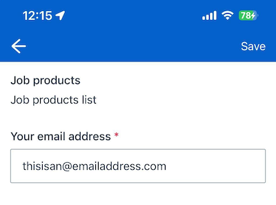
Example validation rule
Validation rules support regular expression (regex) patterns to validate the data input of your text area component. An invalid input will display an error message to the user, and the form will not be saved until the input is corrected.
For example, to validate an email address, use the following regex pattern:
^[a-zA-Z0-9._%+-]+@[a-zA-Z0-9.-]+\.[a-zA-Z]{2,}$
In the Form Builder:
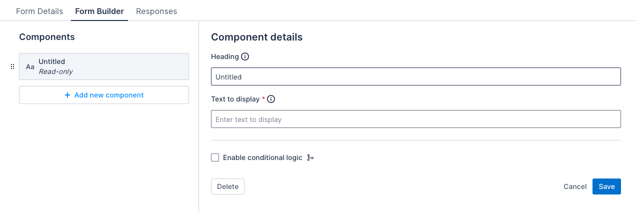
Read-only
The read-only component is used to display information to the user. It is not editable.
Properties
| Property | Description | Required |
|---|---|---|
| Heading | The title of the read-only component. | No |
| Text to display | A description of the read-only component. | Yes |
Example
The image that follows shows how the component appears in a form in the Skedulo Plus app:

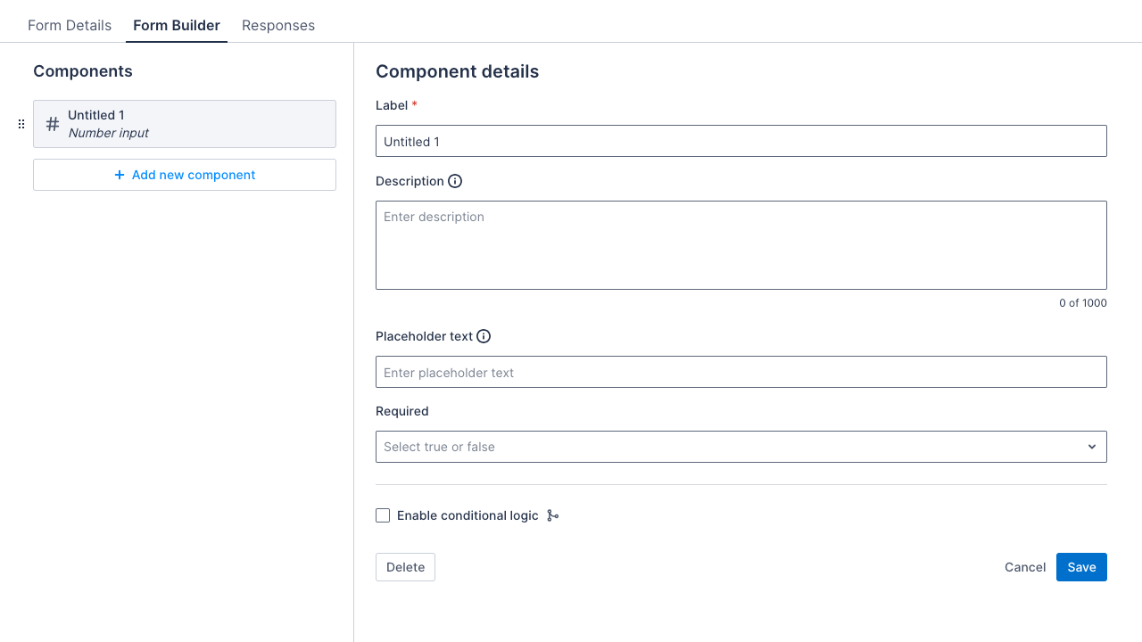
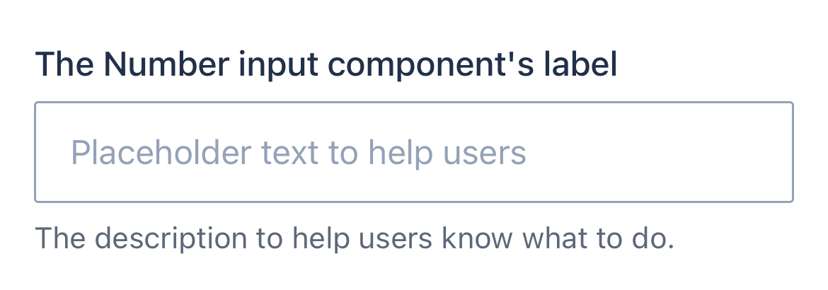
Number input
The number input component is for users to record an integer.
Properties
| Property | Description | Required |
|---|---|---|
| Label | The title of the number-input component. | Yes |
| Description | A text string that displays below the component to provide users with additional information about how to complete the item using this component. The character limit is 2000 and it can contain line breaks and numbered or bulleted lists. | No |
| Placeholder text | A description of what the user should enter. | No |
| Required | If selected, the text input must be completed to save the form. | No |
Note
For data-mapped forms, when you create a number input component, you must map it as follows:
- Skedulo for Salesforce: Map to a number field (Decimal or Double) in Salesforce. The mobile form only accepts integer values.
- Skedulo Pulse platform: Map to an integer field.
Example
The image that follows shows how the component appears in a form in the Skedulo Plus app:
Decimal input
The decimal input component is used to record a decimal number.
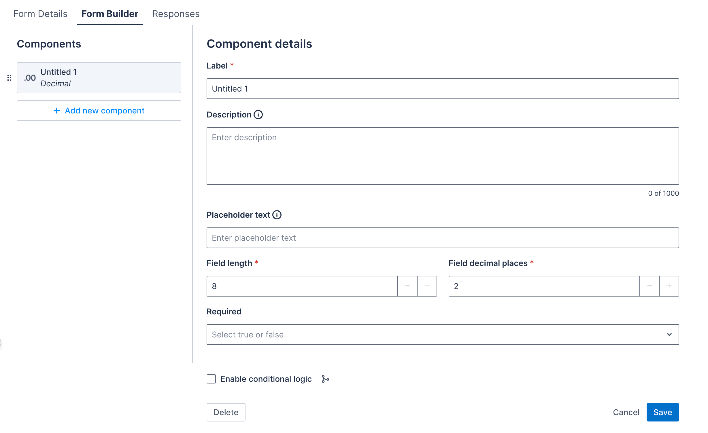
Properties
| Property | Description | Required |
|---|---|---|
| Label | The title of the decimal input component. | Yes |
| Description | A text string that displays below the component to provide users with additional information about how to complete the item using this component. The character limit is 2000 and it can contain line breaks and numbered or bulleted lists. | No |
| Placeholder text | A description of what the user should enter. | No |
| Field length | The maximum of digits allowed before the decimal point. For data-mapped forms, this field is auto-populated from the mapped field and cannot be edited. |
Yes |
| Field decimal places | The maximum number of digits allowed after the decimal point. For data-mapped forms, this field is auto-populated from the mapped field and cannot be edited. |
Yes |
| Required | If selected, the decimal input must be completed to save the form. | No |
Note
For data-mapped forms, when you create a decimal input component, you need to map it as follows:
- Skedulo for Salesforce: Map to a number field (Decimal or Double) in Salesforce.
- Skedulo Pulse platform: Map to a decimal field.
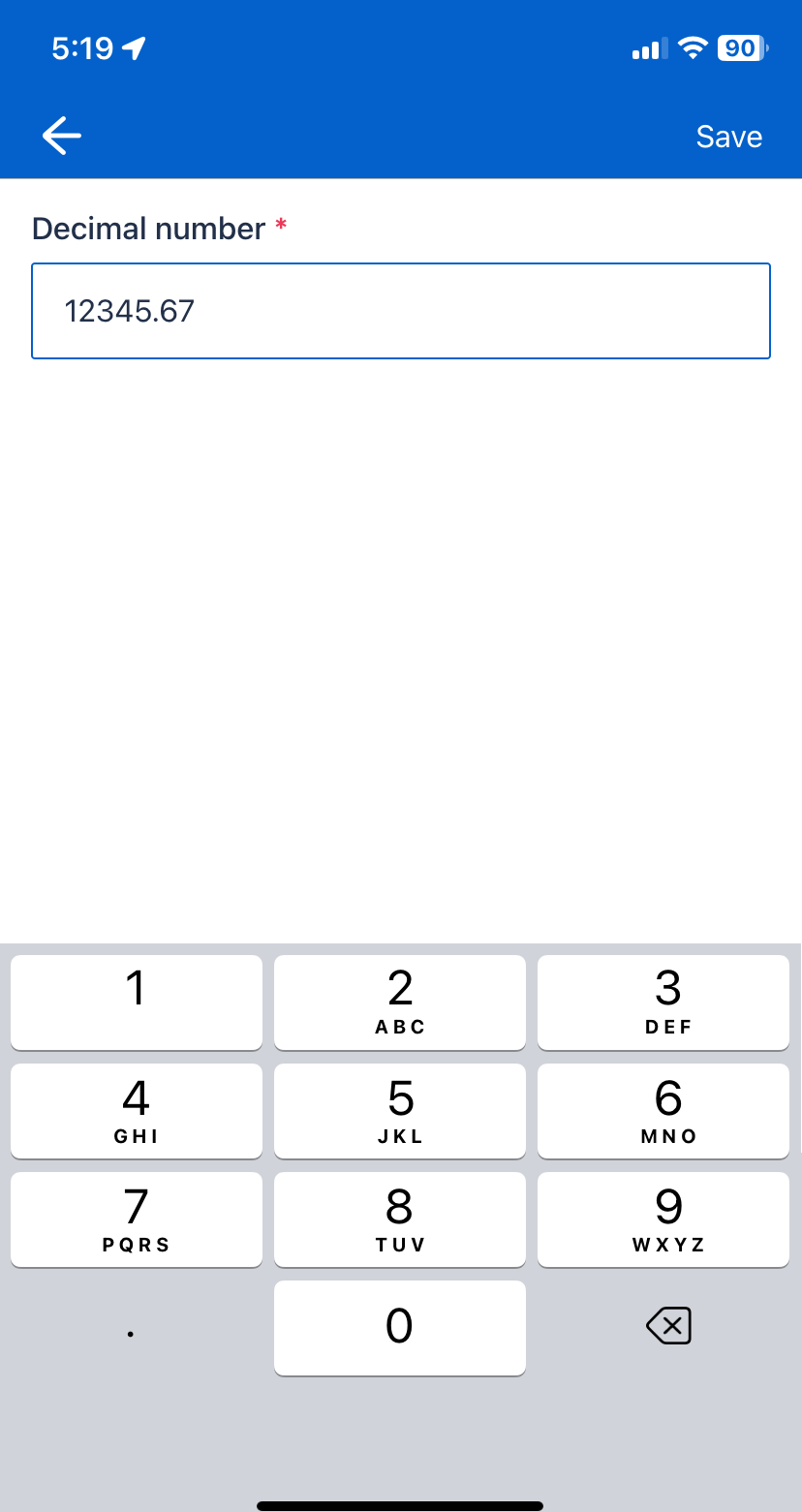
Example
The following image shows how the component appears in a form in the Skedulo Plus app.
In the example below, if the field length is set to 5 and the decimal places to 2, the field can accept the number 12345.67.
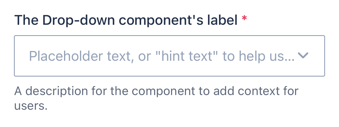
Drop-down
The drop-down component is used to capture a single selection from a list of options. There is no limit to the number of items in the drop-down list.
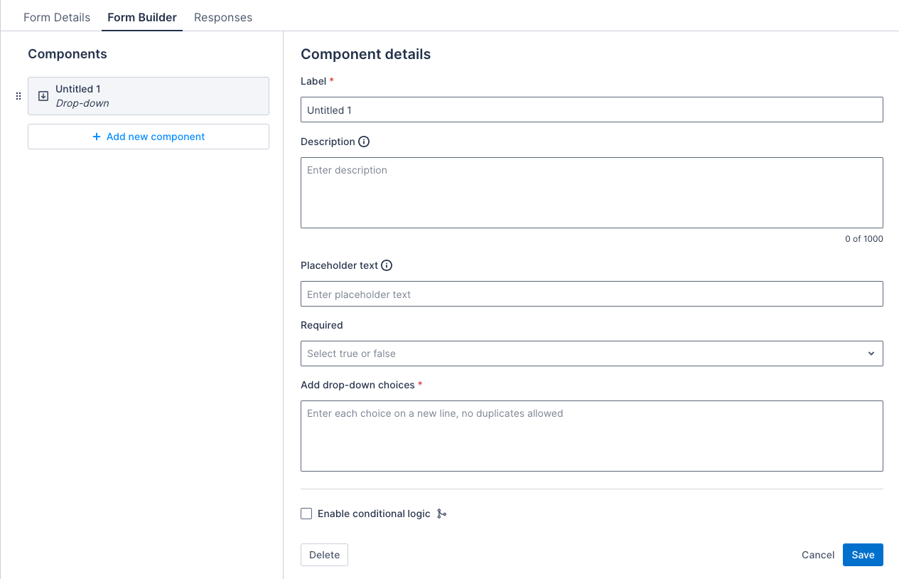
Properties
| Property | Description | Required |
|---|---|---|
| Label | The title of the drop-down component. | Yes |
| Description | A text string that displays below the component to provide users with additional information about how to complete the item using this component. The character limit is 2000 and it can contain line breaks and numbered or bulleted lists. | No |
| Placeholder text | The placeholder text for the drop-down. | No |
| Required | If selected, the drop-down must be completed to save the form. | No |
| Add drop-down choices | Provide a list of items to include in the drop-down list. One item per line. | Yes |
Note
For data-mapped forms, when you map a drop-down component to a picklist field, the drop-down choices are automatically populated from the picklist values of the selected field. These choices cannot be edited directly from the Form Builder page; instead, you need to modify them in the Data management > Objects & fields settings.Example
The image that follows shows how the component appears in a form in the Skedulo Plus app:
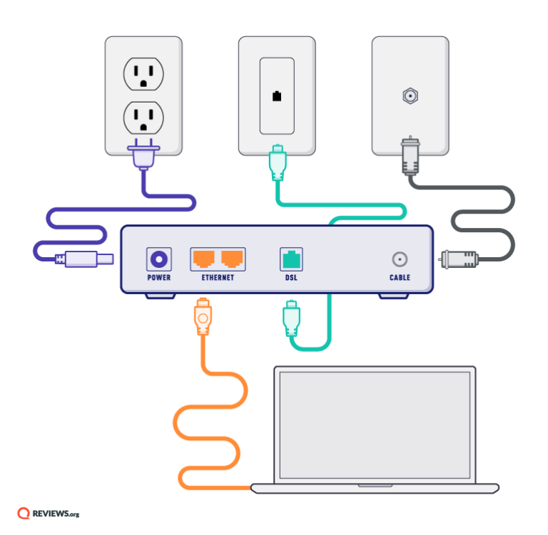
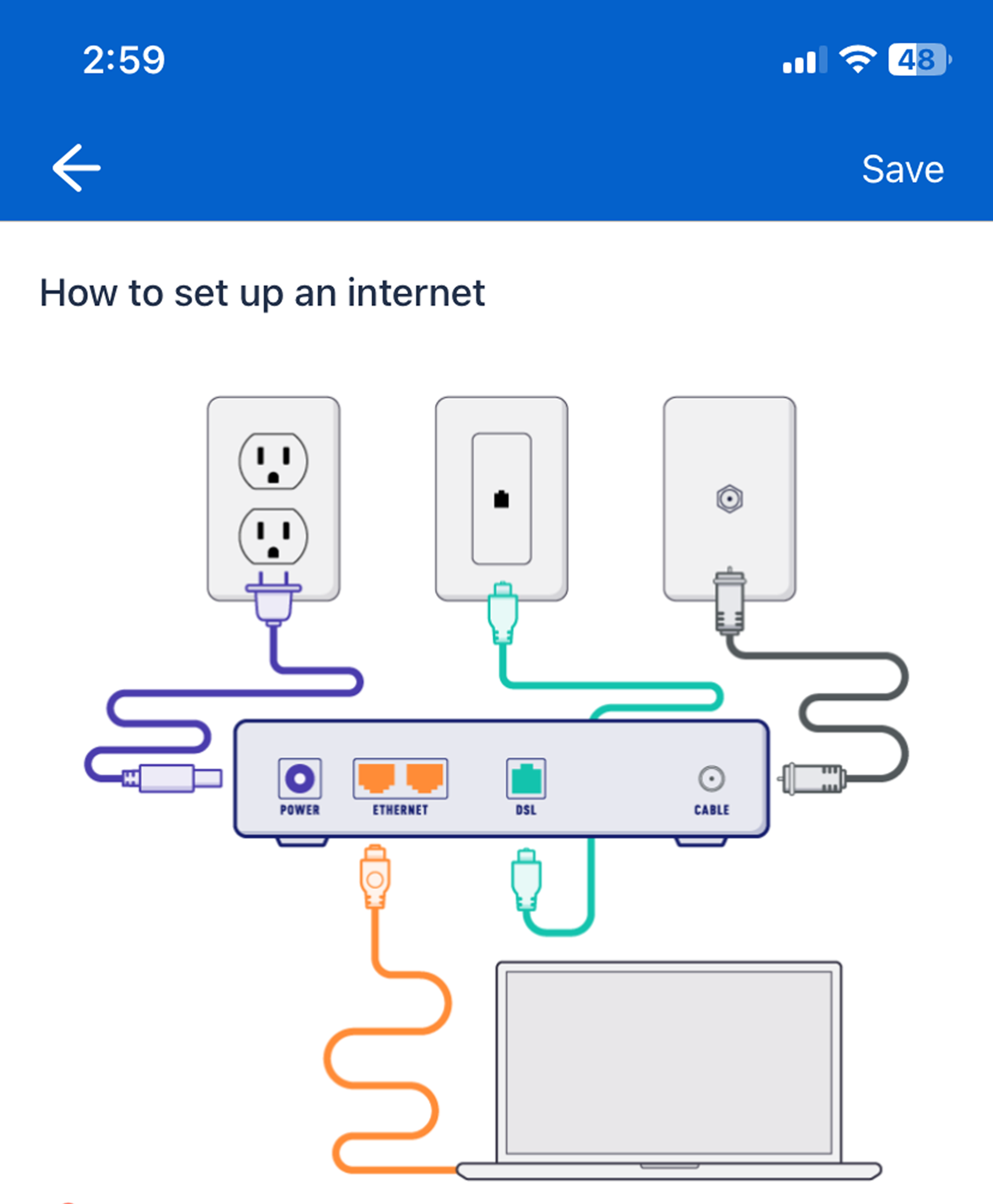
Image
The image component is used to display a static image in a form. The image can be a QR code, an instructional image, or a visual guide.
Note
- The image must come from a public image URL—a web link that opens only the image file, without any additional content or webpage, and is accessible to anyone. This link usually ends in formats like
.jpg,.png, or.gif. For example, this link opens a guideline image. - Mobile users cannot see the images if they are offline.
Properties
| Property | Description | Required |
|---|---|---|
| Label | The title of the image component. | Yes |
| Enter the URL to the image | Provide a public URL for the image. | Yes |
Example
The images that follow show how a static image component appears in a form in the Skedulo Plus app:

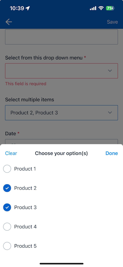
Multi-select drop-down
The multi-select drop-down component is used to capture multiple selections from a list of options.
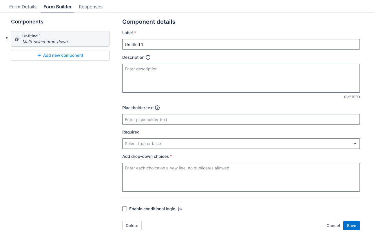
Properties
| Property | Description | Required |
|---|---|---|
| Label | The title of the multi-select drop down component. | Yes |
| Description | A text string that displays below the component to provide users with additional information about how to complete the item using this component. The character limit is 2000 and it can contain line breaks and numbered or bulleted lists. | No |
| Placeholder text | The placeholder text for the multi-select drop down. | No |
| Required | If selected, the multi-select drop down must be completed to save the form. | No |
| Add drop-down choices | Provide a list of items to include in the multi-select drop-down list. One item per line. | Yes |
Note
For data-mapped forms, when you map a multi-select drop-down component to a multi-picklist field, the drop-down choices are automatically populated from the picklist values of the selected field. These choices cannot be edited directly from the Form Builder page; instead, you need to modify them in the Data management > Objects & fields settings.Example
The image that follows shows how the component appears in a form in the Skedulo Plus app:
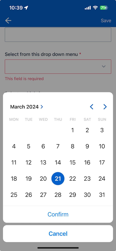
Date
The date component is a date picker used to capture a date from the user.
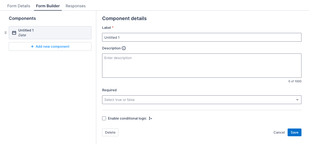
Properties
| Property | Description | Required |
|---|---|---|
| Label | The title of the date component. | Yes |
| Description | A text string that displays below the component to provide users with additional information about how to complete the item using this component. The character limit is 2000 and it can contain line breaks and numbered or bulleted lists. | No |
| Required | If selected, the date must be completed to save the form. | No |
Example
The image that follows shows how the component appears in a form in the Skedulo Plus app:
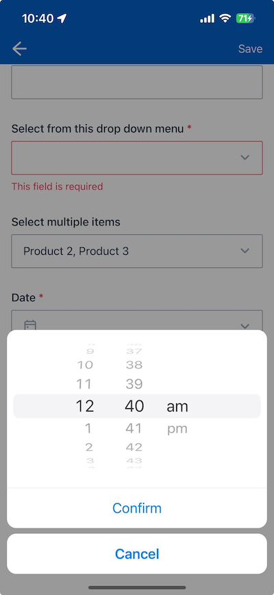
Time
The time component is a time picker that allows users to select a time that is entered in the form data. The time picker uses 12-hour time format.
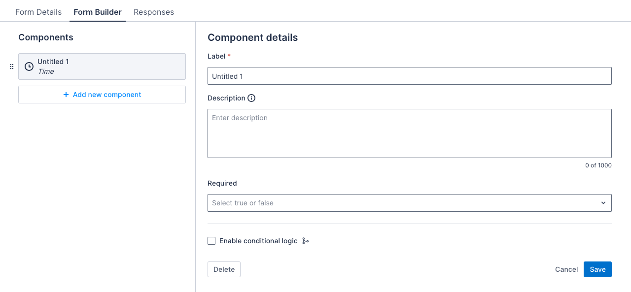
Properties
| Property | Description | Required |
|---|---|---|
| Title | The title of the time component. | Yes |
| Description | A text string that displays below the component to provide users with additional information about how to complete the item using this component. The character limit is 2000 and it can contain line breaks and numbered or bulleted lists. | No |
| Mandatory | If selected, the time must be completed to save the form. | No |
Example
The image that follows shows how the component appears in a form in the Skedulo Plus app:
Toggle
The toggle component is used to capture a true/false selection from the user. The toggle component is set to false by default.
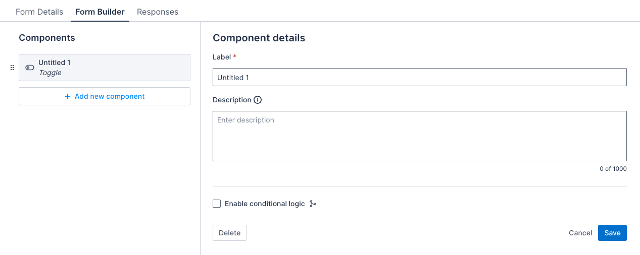
Properties
| Property | Description | Required |
|---|---|---|
| Label | The title of the toggle component. | Yes |
| Description | A text string that displays below the component to provide users with additional information about how to complete the item using this component. The character limit is 2000 and it can contain line breaks and numbered or bulleted lists. | No |
Example
The image that follows shows how the component appears in a form in the Skedulo Plus app:

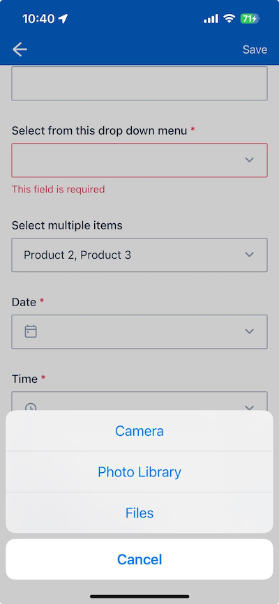
Attachment
The attachment component is used to capture an attachment from the user. Users can upload images from their device gallery, take a photo, or upload a file from their device. All common formats are supported.
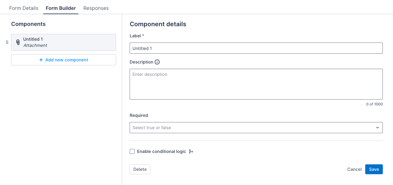
Properties
| Property | Description | Required |
|---|---|---|
| Label | The title of the attachment component. | Yes |
| Description | A text string that displays below the component to provide users with additional information about how to complete the item using this component. The character limit is 2000 and it can contain line breaks and numbered or bulleted lists. | No |
| Required | If selected, the attachment must be completed to save the form. | No |
Example
The image that follows shows how the component appears in a form in the Skedulo Plus app:
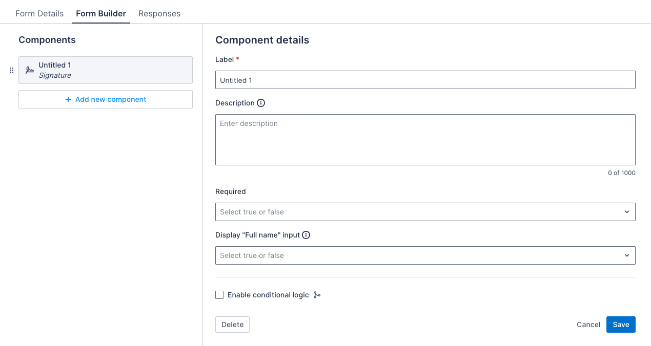
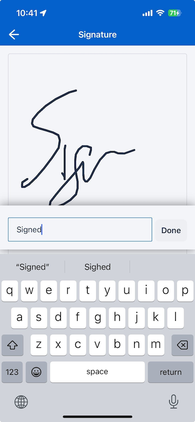
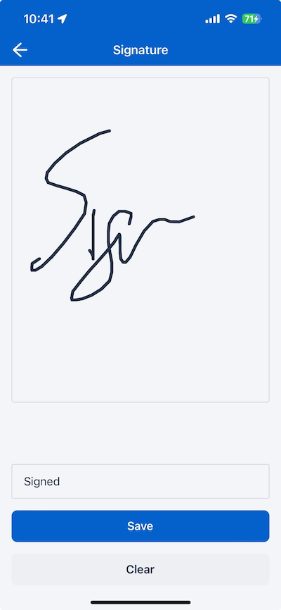
Signature
The signature component is used to capture a signature that is uploaded as an attachment.
Properties
| Property | Description | Required |
|---|---|---|
| Label | The title of the signature component. | Yes |
| Description | A text string that displays below the component to provide users with additional information about how to complete the item using this component. The character limit is 2000 and it can contain line breaks and numbered or bulleted lists. | No |
| Required | If selected, the attachment must be completed to save the form. | No |
| Display “Full name” input | Displays a text field for the user to enter their full name. This setting is false by default. |
No |
Example
- Signature with full name input
Feedback
Was this page helpful?