Customize schedule cards in the Pulse Scheduling Experience swimlane
Beta feature
-
Beta features should be considered “in development” and may not be fully supported or complete.
-
Beta programs are invaluable for helping to validate the value and impact of features through feedback and insights. If you would like to participate in beta programs and access this feature, please contact your Skedulo Customer Success Manager.
Note
The Pulse Scheduling Experience is only available on the Skedulo Pulse Platform.Overview
Work cards are how work items are represented on the Pulse Scheduling Experience swimlane schedule view. They give a brief view of what the work is, and its size and placement indicate when and for how long it is scheduled. Work cards are interactive, so you can click on them to view more information or move and adjust them to reschedule them within the swimlane.
Work card content, that is, the information that is displayed as a header and sub-heading on work cards, can be customized to show standard or custom fields from the Jobs object. The color of the cards can also be customized according to your field of choice. This means that information that is critical to your scheduling process can be displayed and color-coded to easily visualize significant elements of work at a glance.
Customize work cards
Configure the fields that display on work cards
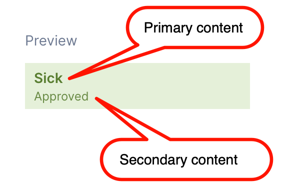
There are two lines of text, or content, on work cards: Primary (heading) and secondary (sub-heading).
To configure which fields display on the work cards, do the following steps:
- In Settings, navigate to Scheduling > Work card styling > New work card.
- Under Customize content, click to open the Primary content displayed drop-down.
- Select a field from the list. The preview image updates to show how the work card would appear with this field as the heading.
- Click to open the Secondary content displayed drop-down.
- Select a field from the list. The preview image updates to show how the work card would appear with this field as a sub-heading.
- Click Save to apply the selections to the scheduling views.
Customize the color of work cards
You can customize the color and color-coding of work cards by doing the following steps:
- In Settings, navigate to Scheduling > Work card styling > New work card.
- Under Customize colors, click to open the Color cards by drop-down.
- Select the field by which to color-code work cards in scheduling views. The Set colors section updates according to the field you select.
a. If the field has pre-defined values, for example, a picklist like
statusortype, then the Set colors section displays all values. Click the circle next to each value and then select the color to display. The previews update accordingly. Click Save to apply your selections.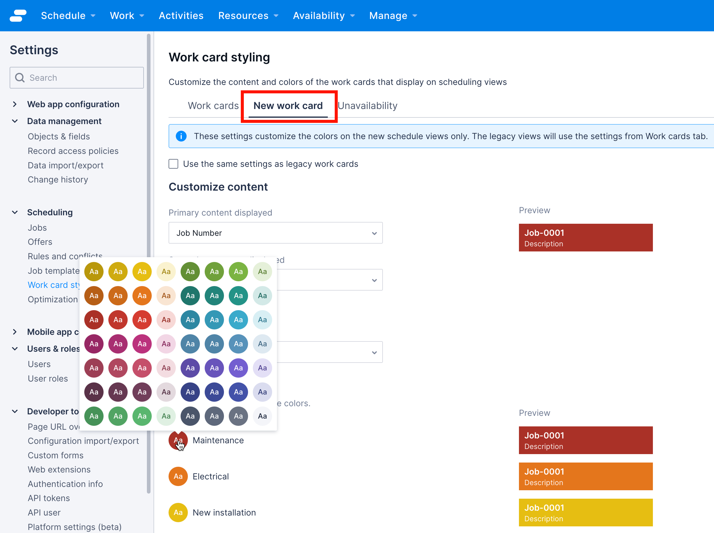 b. If the field values depend on the data in your system, for example,
 locationoraccount, then a default color option displays with an + Add another button to color cards according to specific field values. Click drop-down to select a field value and then click the circle to select a color for that value. Click Save to apply your selections.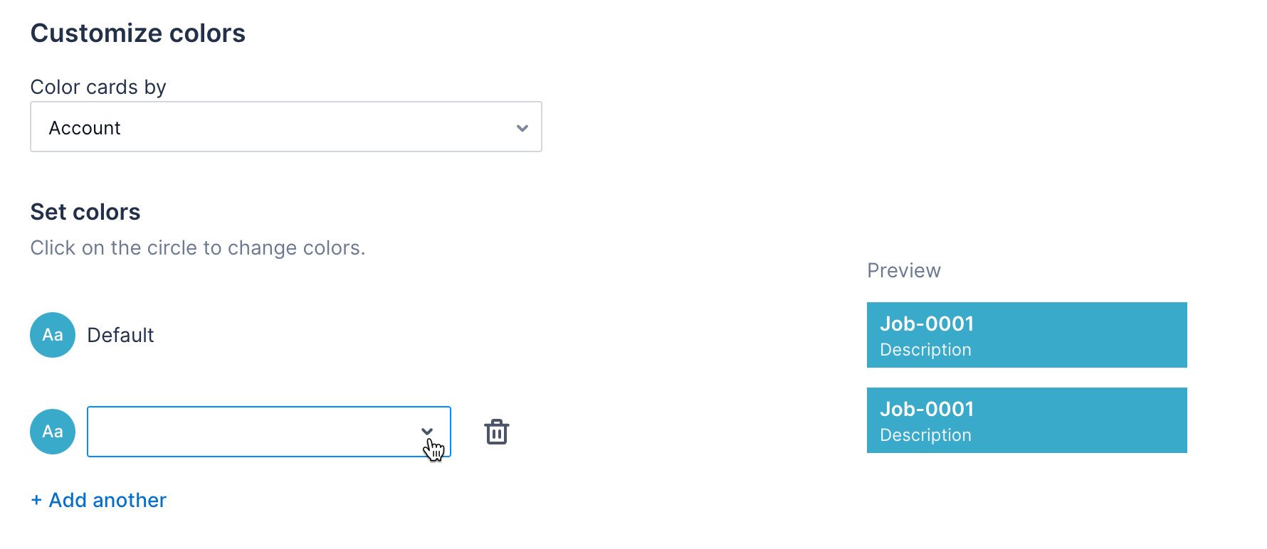
Important
If additional picklist items or values are added to the field that work cards are colored by, then additional configuration will need to be done here to specify the color of the new values.Customize unavailability cards
The appearance of periods of unavailability in the new swimlane can be customized to make it easier to see differences in status or type, depending on the needs of your business processes and organization. For example, you can configure periods of unavailability to appear a different color depending on whether the unavailability request has been approved or not. You can also customize which fields are shown on the swimlane for these periods when resources can not be allocated work.
For more information about unavailability requests, see the Create unavailability documentation.
Customize the content shown when a resource is unavailable
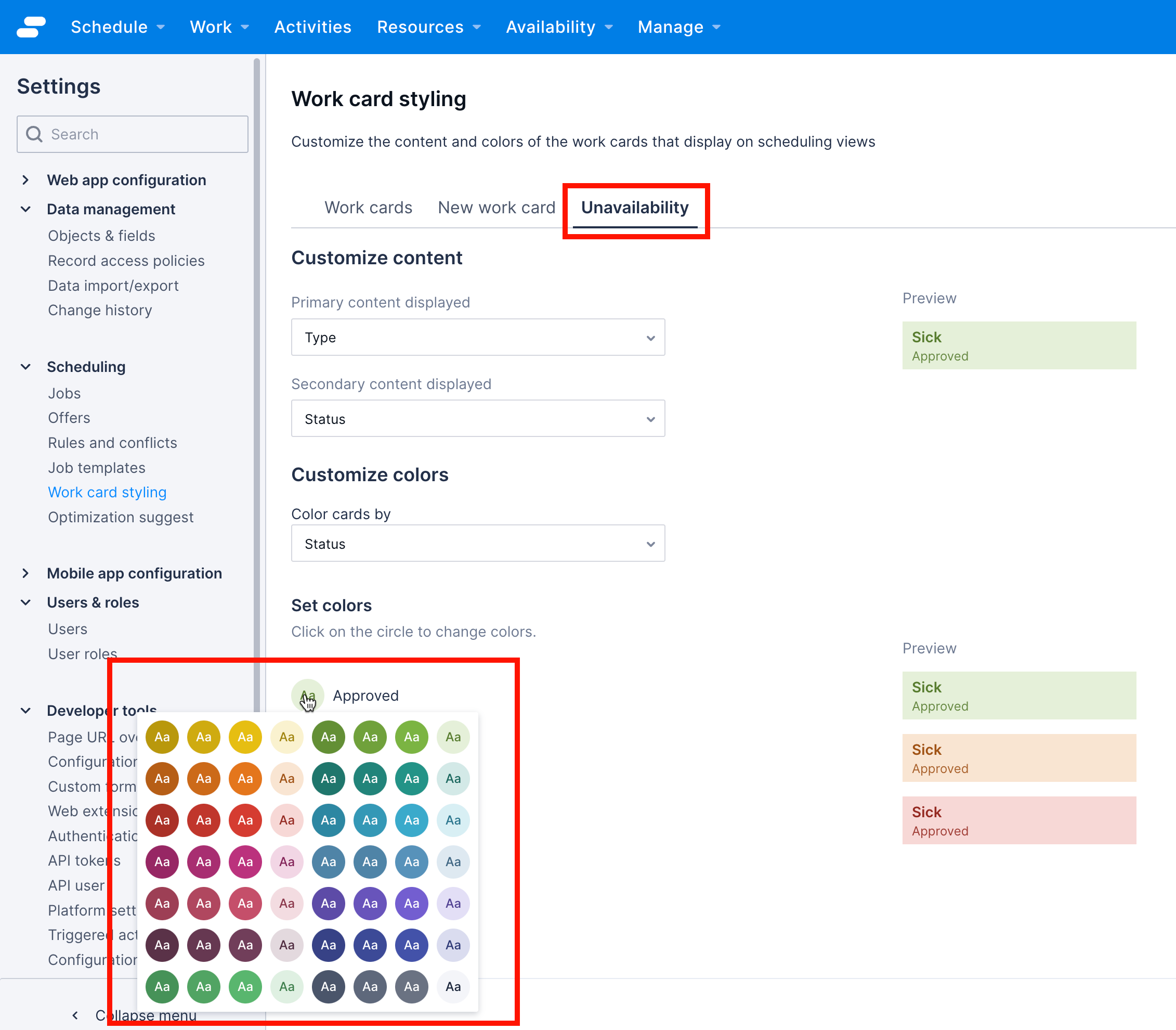
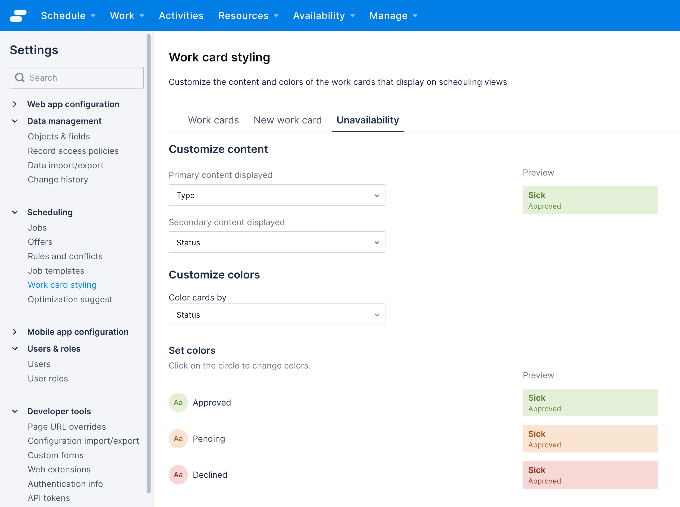
- Navigate to Settings > Scheduling > Work card styling and click the Unavailability tab.
- Under Customize content, click to open the Primary content displayed drop-down.
- Select the field to display as the heading of unavailability periods in the swimlane. The preview updates to show how the card would appear.
- Click to open the Secondary content displayed drop-down.
- Select the field to display as the sub-heading on periods of unavailability in the swimlane. The preview updates to show how it would appear.
- Click Save to apply these selections, or configure the color of the cards by following the steps described in the section that follows.
Customize the color-coding of periods when a resource is unavailable
- Navigate to Settings > Scheduling > Work card styling and click the Unavailability tab.
- Under Customize colors, click to open the Color cards by drop-down.
- Select the field by which to color-code the unavailability cards.
3a. If the field has pre-defined values, for example, a picklist like
statusortype, then the Set colors section displays all values. Click the circle next to each value and then select the color to display. The previews update accordingly. Click Save to apply your selections. 3b. If the field values depend on the data in your system, for example,locationoraccount, then a default color option displays with an + Add another button to color cards according to specific field values. Click drop-down to select a field value and then click the circle to select a color for that value. Click Save to apply your selections.
Customized unavailability card use case example: Color by request status
A common use case for custom card styling for unavailability cards is to color the cards by status so that it is easy to see which requests have been approved, and so represent periods where the resource is not available, and those that are pending or have been denied, where the resource may still be available for work allocations.
Note
These steps are a suggestion and can be changed to suit your particular use case requirements.To configure unavailability requests to appear differently according to their status, do the following steps:
- Navigate to Work card styling > Unavailability.
- Under Customize content, click to open the Primary content displayed drop-down and then click Type.
- Click to open the Secondary content displayed drop-down and then click Status.
- Under Customize colors, click to open the Color cards by drop-down and then select Status.
- Click the circle next to each status and select a color style for each one.
- Click Save.
Feedback
Was this page helpful?