Advanced component layouts
Beta feature
This feature is currently in beta, and should be considered ‘under development’, learn more here.Overview
If you’re building a page that has many components, at some point you’ll want to control how those components are aligned, how much space are between components and other basic aspects of the layout. This is where the Layout container component is very useful. In this article, we’ll walk you through building a more complex version of the “Contacts tab” for the Accounts object.
Getting to know the Layout container component
Before we jump into a tutorial, let’s first take a look at the layout container component.
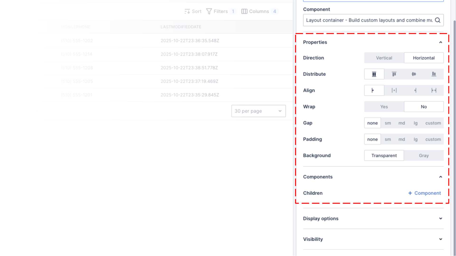
The layout container has many properties that change the way that it renders child components.
| Property | Options | Description |
|---|---|---|
| Direction |
|
The direction of flow for child components |
| Distribute | Depends on Direction:
|
How the child components are distributed on the main axis of flow |
| Align |
|
How the child components are aligned on the main axis of flow |
| Wrap |
|
Allow child components to wrap to new lines |
| Gap |
|
The spacing between child components |
| Padding |
|
Internal padding of the layout container component |
| Background |
|
The background of the container |
Adding a “Create new” button to the Contact tab of an Account detail page
We showed you how to add a list of related contacts to an account page in a previous tutorial, if you haven’t added a Contacts tab to your account page, follow the instructions in that tutorial first!
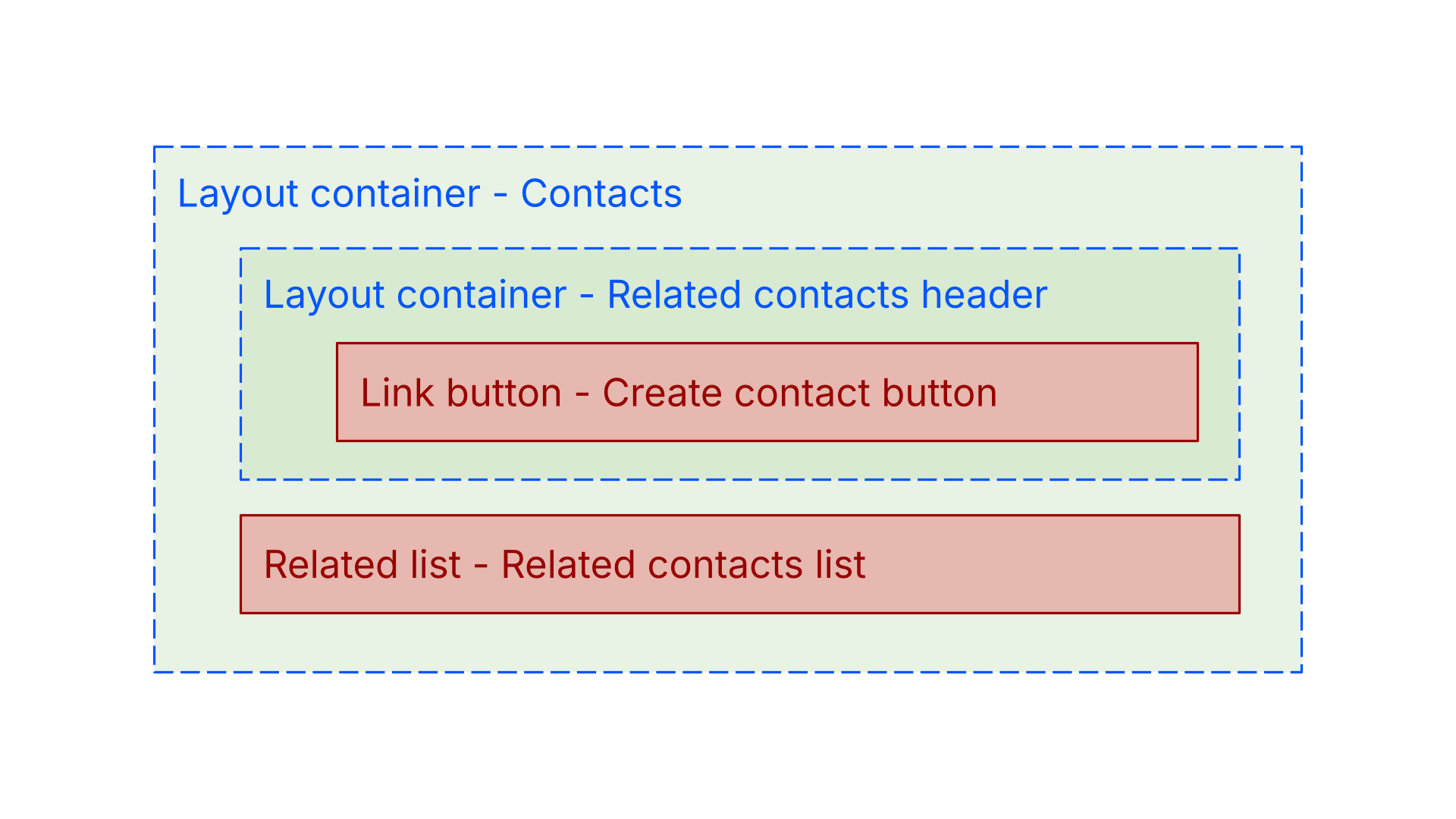
In this tutorial we’ll enhance the tab to include a “Create new” button, so your users can create a new contact. We’ll use 2 layout containers to acheive our desired look and feel. We’ll use the first layout container to create 2 rows one for a header, the other for the related list. The second layout container will allow us to add one or more buttons to the header.
The following image outlines the basic structure we’re going to create.
Open page builder for an account detail page
- Navigate the accounts list, https://<your-team>.my.skedulo.com/p/accounts
- Click on an account to open the detail view
- Open the page builder by clicking on the gear icon in the lower right of the screen
Replace the related list with layout container
To acheive our desired layout, we’re going to use two layout containers, one nested inside the other.
- Click the pencil icon on the Contacts tab
- Change the Component from Related list to Layout container
- Set the Direction property to Vertical
- Expand the Display options properties group
- Set Size to Auto
If you don’t set the Size of this first layout container to “Auto”, it will default to “Full” and the header and the list will both take up %50 of the available height.
Create “Related contacts header”
- In the Components section, click the + Component link to add a new child component to this container
- Set the Component label property to “Related contacts header”
- Set the Component property to Layout container
- Set the Direction property to Horizontal
- Set the Align property to End
- Set the Padding property to md or medium
- Click + Component link to add a child component
- Set the Component label property to “Create contact button”
- Set the Component property to Link button
- Click the + Optional property link, and add Label, Type and Path properties
- Set the Label property to “Create new”
- Set the Type property to “Primary”
- Set the Path property to “/p/contacts/create”
- Expand the Display options properties group
- Set Size to Auto
- Click Save to save changes to the “Create contact button”
- Click Save again to save change to the “Related contacts header”
Create the “Related contacts list”
Make sure your configuring the top level “Contacts” tab layout container.
- In the Components section, click the + Component link to add a new child component
- Set the Component label property to “Related contacts list”
- Set the Component property to Related list
- Set the Related list property to Contact
- Click Save to save changes to the “Related contacts list”
- Click Save again to save change to the “Contacts” tab
- Click Publish to make the changes available to all users
Your page should look like something like the image below.
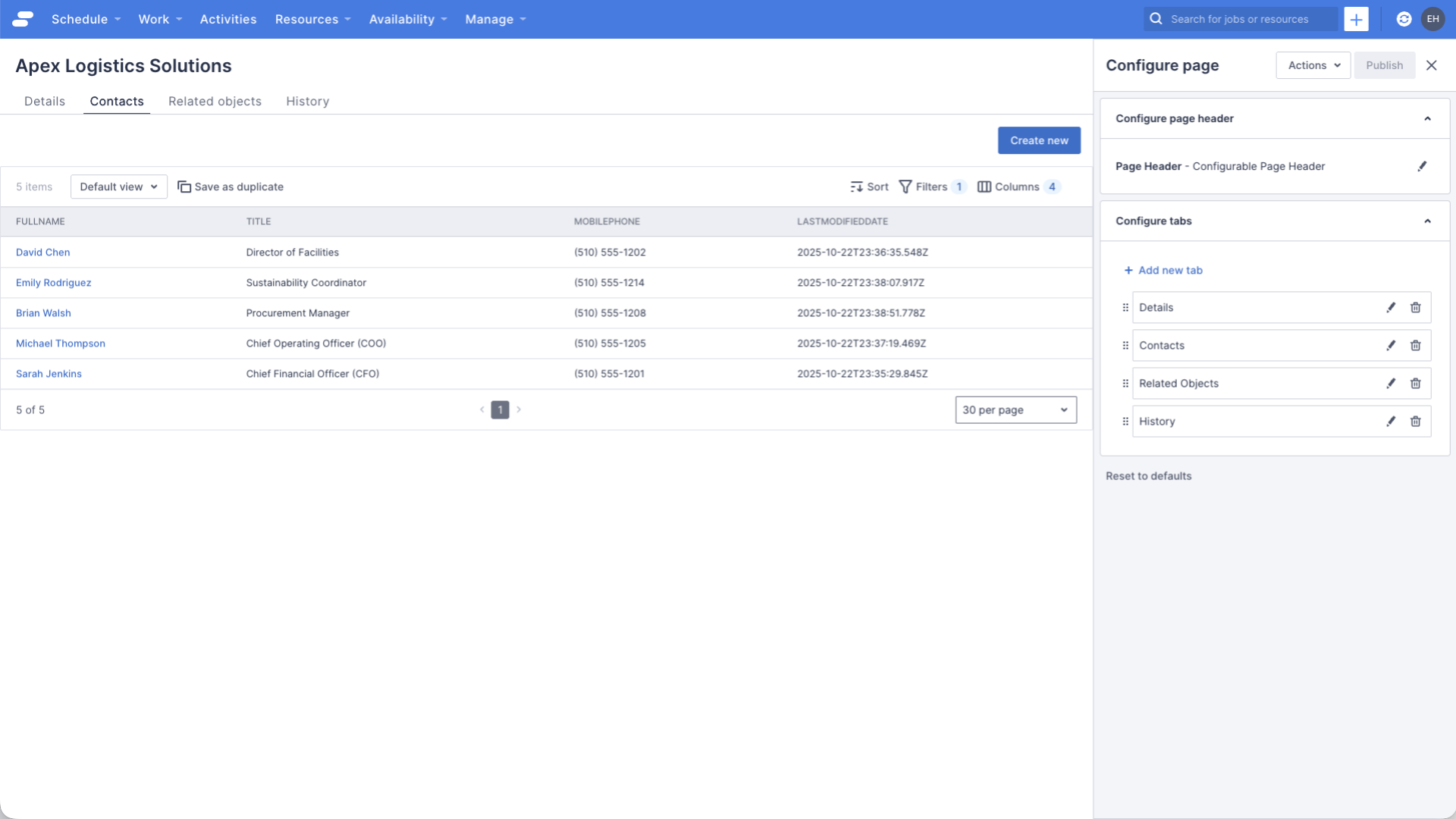
Notice the following:
- The header is above the related list, this is because we set the top level layout container’s Direction property to “Vertical”, and the header is the first child component
- The “Create new” button is aligned to the right, this is because the second level layout container’s Direction property is “Horizontal”, and the Distribute property to “Bottom”
Try clicking on the “Create new” button, it should navigate you to the page to create a new contact.
See also
Feedback
Was this page helpful?