Interact with dashboards
Overview
Skedulo has an embedded tool, Looker, that provides data insight and reporting functionality. It is intended for schedulers who need near real-time insights about operations and managers who need business metrics to support decision-making.
Dashboards
Dashboards contain a set of Looks, which are individual analytic widgets. Skedulo comes with four standard dashboards and more can be added by users with Design permissions.
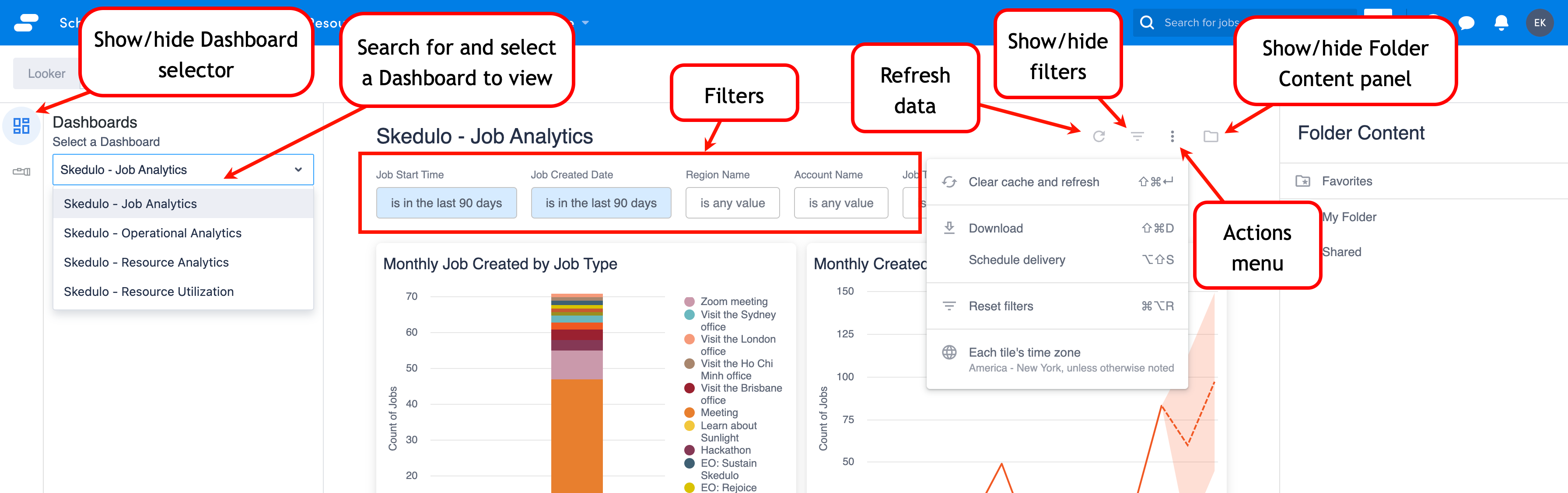
Filter data
Use filters to customize the view of the data in the dashboard.
If the filters are not visible, click the show/hide filters icon.
Change the filter parameters and then click the refresh icon to apply the filters to the dashboard.
Cross-filter data
Cross-filtering is enabled in the standard dashboards, so when you click on part of a Look, for example data from one region, then the other looks on the dashboard update to show analysis for that region as well. In other words, filtering on one Look applies the filter across all Looks on the dashboard.
Export data
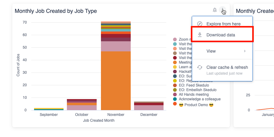
Download a Look
To download an individual Look from a dashboard, do the following steps:
- On the Look of interest, click the action menu icon (stacked ellipsis).
- Click Download data.
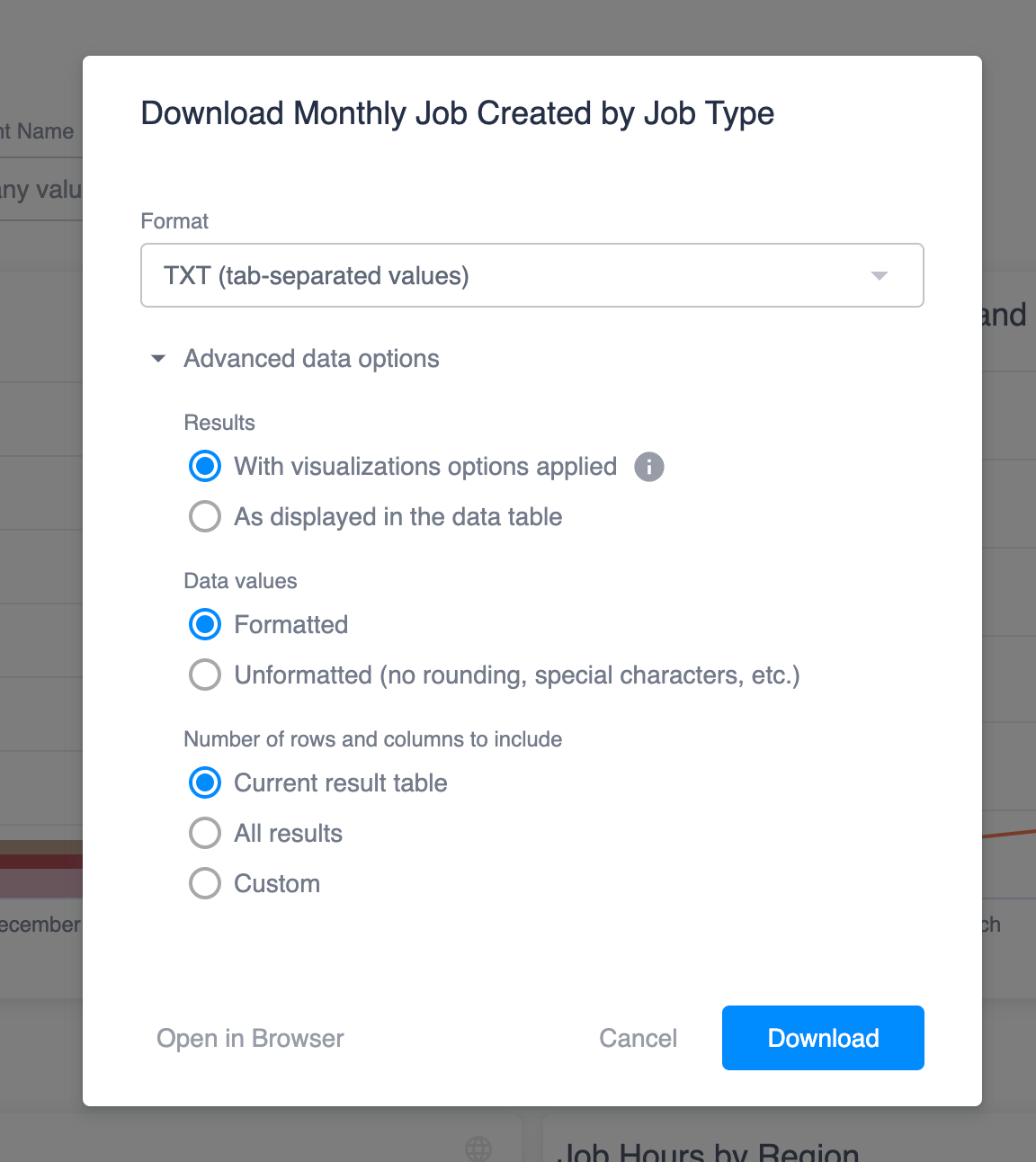
- Select the format you require (supported formats: TXT, XSL, CSV, JSON, HTML, Markdown, PNG).
- Optionally expand the Advanced data options section and make changes as required.
- To save the file to your local device, click Download. Alternatively, to see the report in a browser tab instead, click Open in Browser.
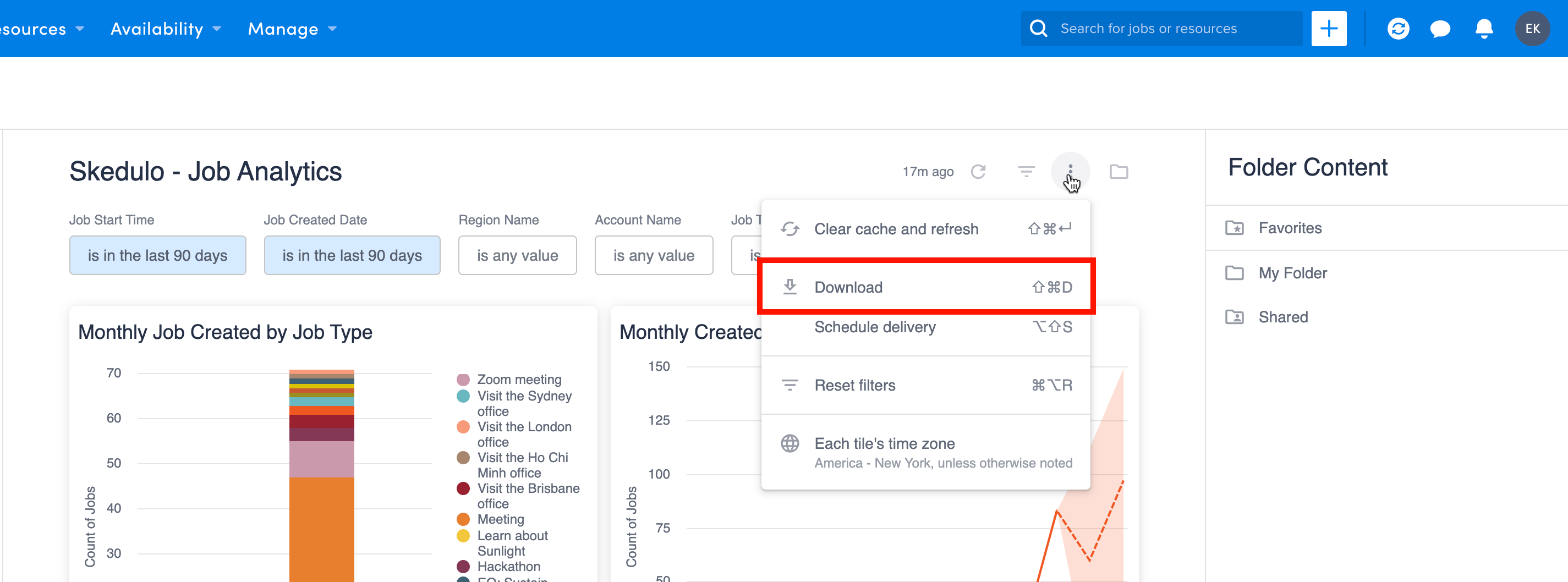
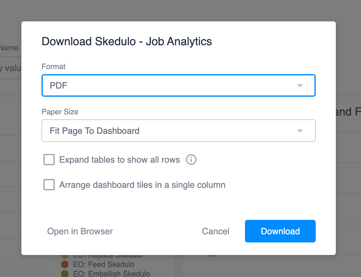
Download a dashboard
If you want to capture all the Looks in a single report, you can download the dashboard.
To download a dashboard, do the following:
- At the top of the dashboard, click the action menu icon (stacked ellipsis).
- Click Download.
- Select the report format (PDF and CSV files are supported). If you select PDF, there are additional settings for how the data should be displayed and there is also the option to view the PDF in a browser tab rather than downloading it.
- Click Download.
Drill down into a Look
Each Look tile can be viewed in more detail by clicking the action menu icon on the Look and then selecting View > Expanded.
From the expanded view, you can click on individual data points to filter further or to link out to the record in Skedulo, for example, a job or resource.
Change the dashboard time zone
Looker provides the ability to view the analytics in a specified time zone, or to use the time zone that is selected for each Look when it is created. If it is not specified, then it will display using the default time zone for your team.
To change the time zone for a dashboard, do the following:
- At the top of the dashboard, click the action menu icon (stacked ellipsis).
- Click the time zone item at the bottom of the list.
- Select the required time zone option and then click Update.
Set alerts
Alerts can be set for any Looker to email one or more people when a data condition has been reached, for example if the number of cancelled jobs exceeds a certain number. Alerts can only be set on Looks that use quantitative data.
To set an alert, do the following:
- On the Look that uses the data of interest, click the alert icon.
- If there are already alerts configured, click New. Otherwise ignore this step.
- Replace the title with a descriptive name of your own.
- Your email is added by default; add any other email addresses that should receive the alert.
- Set the frequency of the alert and the time.
- Click Save Alert. The alert will show in the Look’s Alerts modal, where you can choose to add another alert or click Done to return to the dashboard.
Manage alerts
If a Look has an alert set for it, it will display a badge on the alert button when your mouse hovers over the Look. You can do the following things by clicking on the alert icon:
- Create a new alert for the Look.
- Follow (subscribe) to alerts that have been configured by other users.
- Edit an existing alert.
- Duplicate an existing alert to make it easier to add new ones.
- Delete alerts.
Schedule reporting
Looker allows you to schedule regular reports to be emailed to users with or without a Looker licence.
To schedule reports, do the following:
- At the top of the dashboard, click the action icon and then click Schedule delivery.
- If there are items already scheduled, then click New. Otherwise ignore this step.
- Change the Schedule Name, if required. This will form the subject of the email and the report’s filename.
- Set the Recurrence and Time for the report to be sent.
- Your email is added by default, but you can add others as required.
- Select the format for the report (CSV, PDF, and PNG are supported).
- Make additional configuration changes in the Filters and Advanced options tabs, if required.
- To save the report schedule, click Save.
Email recipients will receive the report, as well as a link to the dashboard.
Note: It is recommended that you test the report before finalizing the email addresses and saving the report schedule. You can do this by clicking Test now before saving.
Send a scheduled report on demand
If a report must be sent outside of it’s scheduled time, you can send it on demand by doing the following:
- At the top of the dashboard, click the action icon and then click Schedule delivery.
- Identify the report to send and then click Send now.
Manage a scheduled report delivery
If a dashboard has a scheduled delivery configured, then you can do the following things by clicking on the action icon and selecting Schedule delivery:
- Create a new scheduled delivery.
- Edit an existing delivery.
- Duplicate an existing delivery to make it easier to add new ones.
- Delete a delivery.
Standard dashboards
Skedulo - Job Analytics
Cross-filtering is enabled on this dashboard.
| Look tile name | Description |
|---|---|
| Monthly Job Created by Job Type | The number of jobs, grouped by job type, that were created per month. |
| Monthly Created Jobs Trend and Forecast | The number of jobs created per month and the expected trend for the coming months. The forecast is calculated using a the ARIMA algorithm. |
| Geographic Distribution of Jobs | Visualization of the job locations on a map. |
| Job Hours by Region | A count of jobs per region and the sum of actual hours recorded for those jobs. |
| Weekly job completed and cancelled rates | The percentages of jobs that were canceled and completed out of all jobs that were not yet started, per week. |
| Job completed and cancelled rates by job type and region | Counts and percentages of jobs that were canceled and completed per job type and region. |
| Job cancellation reasons | Pie graph showing reasons that jobs were canceled. |
| Job declined reasons | Pie graph showing reasons jobs were declined. |
| Average travel time | Average time travelled for all jobs per month. |
| Average travel time by region | Average time travelled for jobs per month by region. |
| Jobs created by | Count of jobs created per scheduler. |
| Jobs by customers | Various job statistics per customer, for example, job counts, percentage of jobs completed and cancelled, and total hours completed. |
Skedulo - Operational Analytics
Note that this dashboard includes Looks from different Explores, so cross-filtering cannot be used.
| Look tile name | Description |
|---|---|
| Daily job stat summaries | A quick reference to see how many jobs have been completed, are in progress, have been canceled, started late, or ran long. By default this is given for the last day, however, filters can be changed as required. |
| Job by Job Status | A count of jobs per job status, for example, pending dispatch, complete etc. |
| Job cancellation reasons | Pie chart of reasons given for cancelling jobs. |
| Job allocation list view | A table of all jobs currently allocated to a resource. The job name links to the job record in Skedulo. |
| Resource availability | A table showing resources that are available in a timeslot. |
Skedulo - Resource Analytics
This dashboard provides insights into resource trends over the last year. Cross-filtering is enabled on this dashboard.
| Look tile name | Description |
|---|---|
| Productivity leaderboard | A table showing resources ranked by their total scheduled hours, including data on their travel time, and number of allocations, completed jobs, cancelled jobs, and declined jobs. |
| Resource added and churn rate last 12 months | The number of resources added and the churn rate per month. |
| Average jobs allocated per resource last 12 months | A plot showing the resource count and average number of jobs per resource per month. |
| Resource primary region distribution last 12 months | Pie chart showing the percentage of resources in each region. |
| Resource category distribution last 12 months | Pie chart showing the percentage of resources that belong to each resource category. |
| Resource Geographic Distribution | Visualization of the location of all resources plotted on a map. |
| Resource Tag Distribution last 12 months | A count of resources for each tag. |
| Resource Tag expired next 30 days | A detailed table showing the resources with a tag that is set to expire in the following 30 days. |
Skedulo - Resource Utilization
This dashboard focusses on resource utilization, or the amount of time a resource spent on jobs out of the amount of time the resource was available.
| Look tile name | Description |
|---|---|
| Resource availability summary | Number of resources available and number not available in the next 7 days. |
| Resource Allocated next 7 days | Table of resources that are allocated to jobs in the upcoming week, including the number of jobs they are allocated to, their availability, and utilization rate. |
| Resources Not Allocated next 7 days | Table of resources without allocations in the next week and their availability. |
| Estimated Utilization Rate next 30 days | Heat map of estimated utilization rates across all resources for the next month. |
| Actual Utilization Rate last 90 days | Heat map of actual utilization rates across all resources for the previous three months. |
| Weekly Actual Utilization Rate last 90 days by Resource Category | Plot of actual utilization rates per resource category. |
| Resource Utilization Last 7 days | Table detailing the estimated and actual utillization of resources over the last week. |
Feedback
Was this page helpful?